Most images can be clicked to zoom.
Perhaps you need to submit sketches of a pattern for consideration in a publication, or maybe you are just designing for yourself and want to play with color combinations, regardless of your reasons, you don't need a full set of pencils and markers to colorize your drawings and if you use Photoshop, you change the colors over and over again, without having to do a new drawing. I'm going to cover some very simple techniques, that you can build upon to create your own style.
As with all my tutorials I want to make it clear that I'm not an expert, these are just some suggestions. I don't supply support for these methods and cannot offer instructions for older versions or open source alternatives to the program indicated. I am using Photoshop CS3 on a Mac, but will try to provide PC equivalents when I know them.
And, of course, if you have any suggestions, leave them in the comments. I love learning new tips.
Start your sketch
You may download my original, unretouched sketch here, and play along at home. The final document is available here.
I generally do my sketches on paper. I'm not a fine artists, so I often use catalogs as reference for the way clothing drapes and the correct proportions for the human form. I don't like to actually trace images, because I think this looks too stiff. I prefer to just use the image as a visual reference and draw the images by hand. You should do what produces the best results for you.
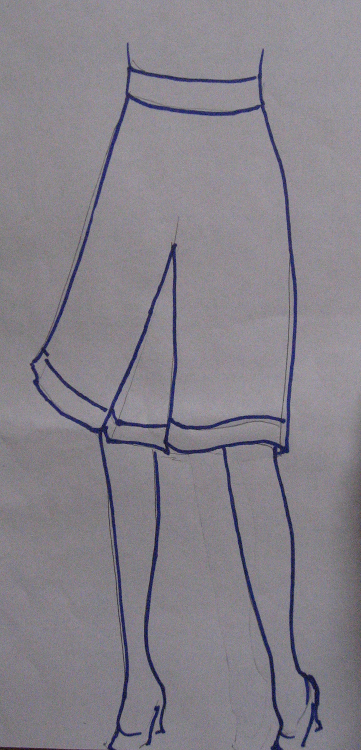
In this case, I want to draw a skirt. I looked around online and found this cute number over at the Gap. I lightly drew my sketch with pencil then outlined only the most important features with a thick dark marker.
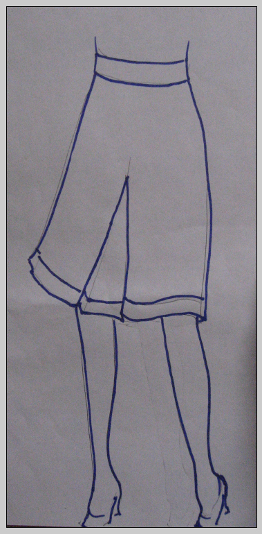
If you have a scanner, great, scan it. I have one but I generally just take a picture with my digital camera, like I have here. The lighting was atrocious that day, so the paper is pretty dark, but that's totally fine.
Now, open the image in Photoshop.
Clean up sketch
Choose IMAGE | ADJUST | LEVELS
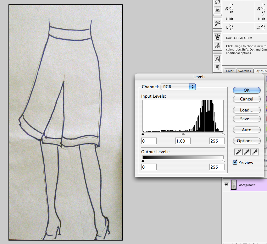
Choose AUTO. This is going to get you some pure whites and blacks on your image.
You may want to enlarge this next image to see how the Levels have been adjusted. You will need to move the white arrow quite far to the right and the gray arrow very close to the black one. Nudging the black arrow right a little will darken the lines. This may not be necessary if you used black instead of blue ink.

Since your image is in color, it'll probably still have a slight hue to it, in places, the next step will fix that up.
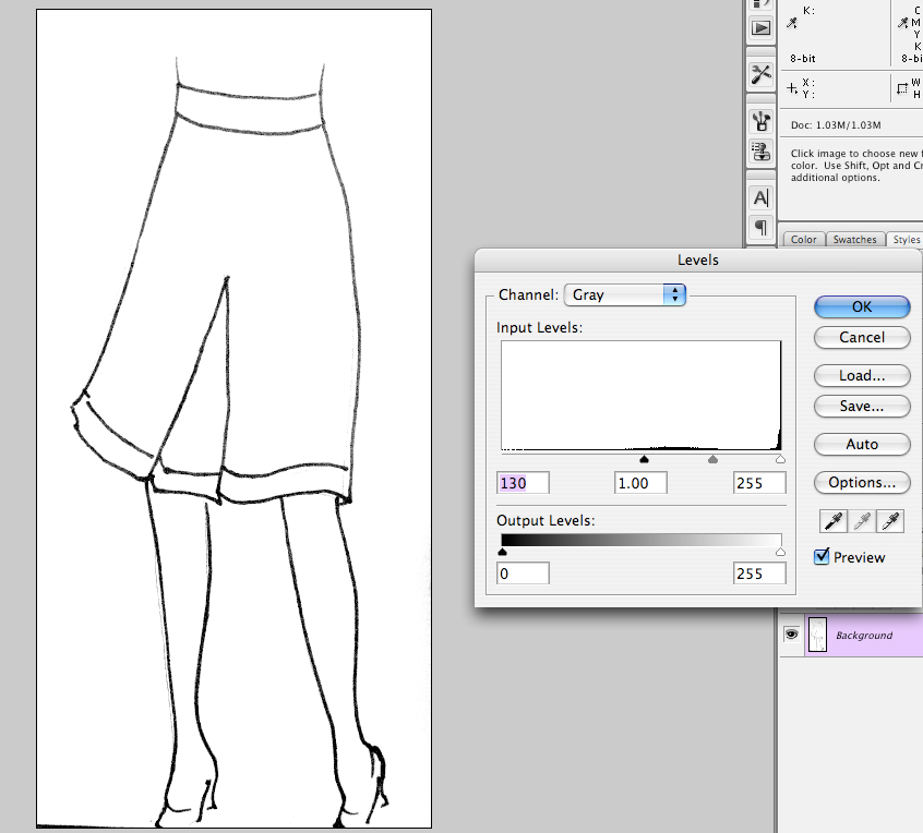
Go to IMAGE | MODE | GRAYSCALE to strip out the color.
Go back to your Levels CMND+L (CTRL+L on PC) and really darken the lines by dragging the black pointer to the right.
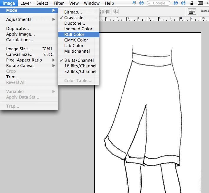
Switch your image back to RGB mode. Your image should now have a dark outline and a white background. If there are a few areas that are wonky, just use the eraser tool to clean them up.
NOTE: If you don't use a thick marker to create your original lines, it's going to be harder to get a good clean outline and a crisp white background.
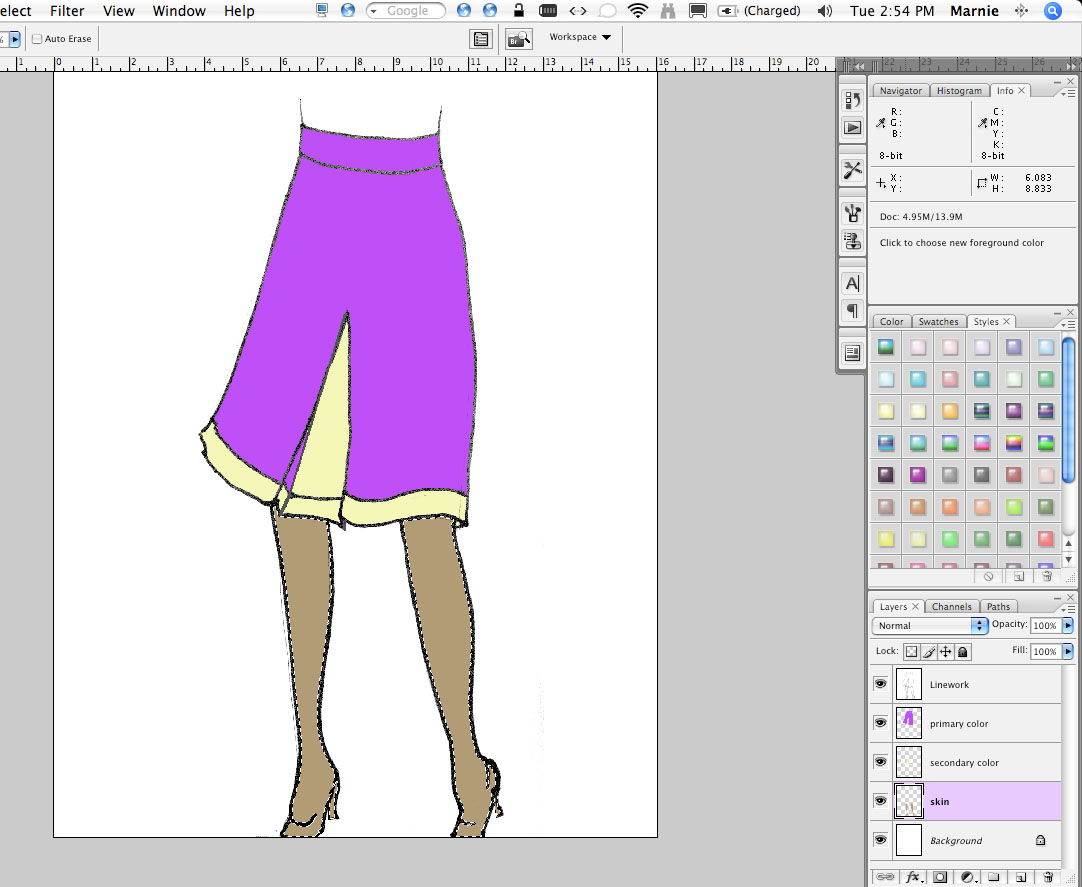
I usually adjust the canvas size (the size of the whole image) at this point,
being sure that white is set as my background color. ![]()
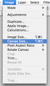
You'll want to make the page big enough that you can include swatches and notes on the side, to better explain what you are going for.
Use the brush tool ![]() (click
the letter B) to close any gaps in your line drawing. If you use the eyedropper
tool
(click
the letter B) to close any gaps in your line drawing. If you use the eyedropper
tool
![]() (click
the letter i) to sample the line nearby, you'll be able to match the color.
Click the closed and open brackets
([]) to increase and decrease the size of the brush to match your original
drawing lines.
(click
the letter i) to sample the line nearby, you'll be able to match the color.
Click the closed and open brackets
([]) to increase and decrease the size of the brush to match your original
drawing lines.
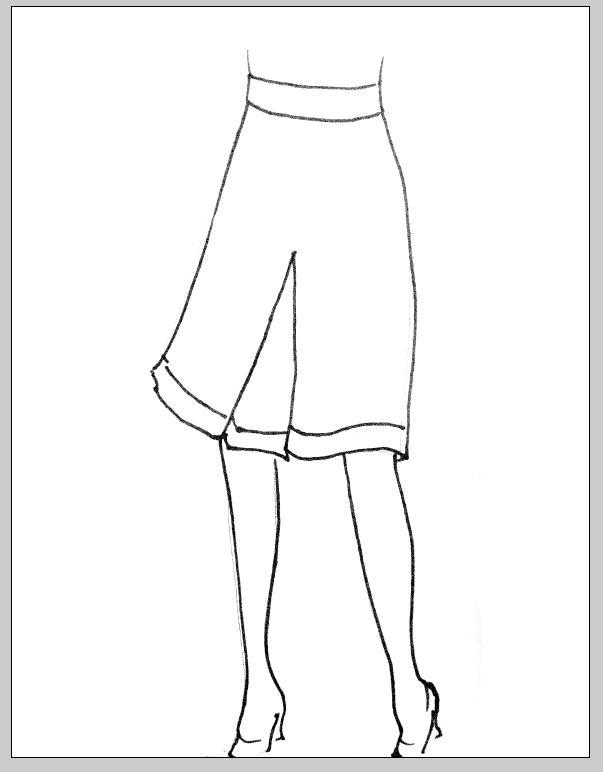

Notice that I also added in a missing line to the front pleat. This is your chance to get all your little details fixed up.
Quick tip: To draw a straight line, such as the line on the inside of the pleat, click at the first point, hold down the shift button, then click on the destination point. In this case, I clicked from the point on the hem to the top of the pleat.
Copy and paste the drawing to a new layer (or you can drag the background layer to the icon for a new layer in the layers palette). Set the layer blending mode to MULTIPLY by clicking the word NORMAL at the top of the palette and choosing MULTIPLY from the list. Double click the name of the layer to give it a more meaningful name.
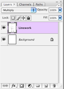
Setting the layer to MULTIPLY makes it possible to place color below the drawing, without having to clear out all the white areas of the drawing, yet maintains the dark lines.
Block out major color areas
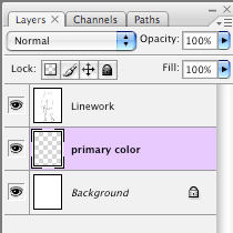
Add a new layer. I'm calling it, "Primary Color" as it will be the
dominant color in the garment. This layer must appear BELOW the linework layer.
With
your Magic Wand tool ![]() (click
the letter W) click an area that should be a primary color. Holding down SHIFT, you can click on any other areas that should be the same color. You may need to adjust your wand settings if it isn't selecting the area fully. If you click and area and it selects more than the area you inteneded, you may have a gap in your sketch. Use your brush tool to close any gaps.
(click
the letter W) click an area that should be a primary color. Holding down SHIFT, you can click on any other areas that should be the same color. You may need to adjust your wand settings if it isn't selecting the area fully. If you click and area and it selects more than the area you inteneded, you may have a gap in your sketch. Use your brush tool to close any gaps.
Set your foreground color to any color at all. It's ok if it's not the actual color you want it to be, it just has to be something other than white or black. I've chosen purple.

With your skirt still selected AND with the Primary Colors layer active, fill the selected area by typing, OPTION+DEL.

If you prefer, you can fill using the EDIT | FILL option from the menu or the Bucket tool.
Repeat with the secondary color creating a new layer for it so that the two colors have their own layers.
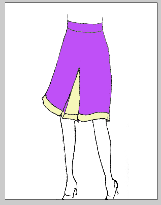
Do this once more for the skin.
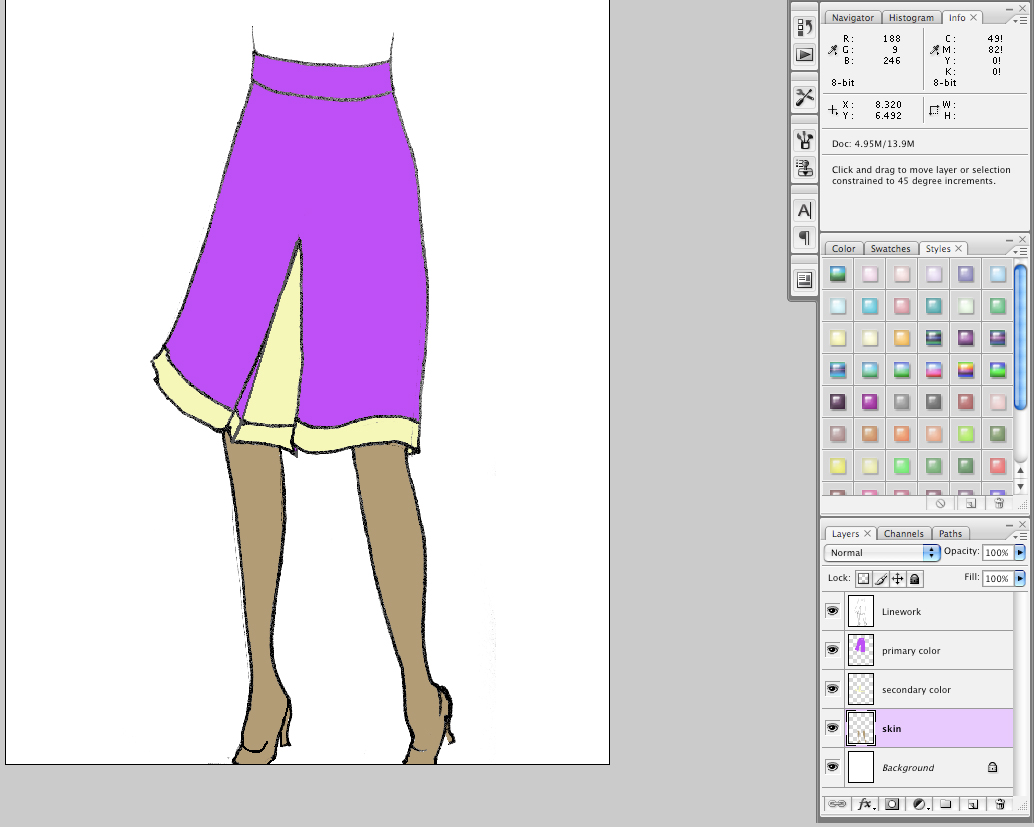
Shading
First, add a new layer over the top of the skin layer and call it "Skin Shading" or something meaningful to you. Set the blending of the layer to MULTIPLY, just like you did with the original sketch layer.
With the Brush Tool [B] ![]() ,
set the brush settings to about 10-20% opacity and a good soft edged brush
that is about the same width as the legs in the drawing. Your options
might look a little like this:
,
set the brush settings to about 10-20% opacity and a good soft edged brush
that is about the same width as the legs in the drawing. Your options
might look a little like this:
![]()
In the skin layer, hold down CMND (CTRL on PC) and select the little thumbnail of the layer. This should select just the non-transparent areas of the layer. You could achieve the same effect with the magic wand.
Go back to the shading layer and begin to add just a bit of shading to the edge of the legs. Because you selected the legs shape, the brush will not draw outside of the selection. This will allow you to gently apply the shading to just the edges. You can adjust the brush size with the brackets ([]) and can delete the shading with the eraser, as needed.
Repeat this exact same process with the other two layers, making sure that each shading layer is it's own layer above it's corresponding color layer.
If you were extra spiffy, you could certainly add a highlight layer too. With a highlight layer, you'd want to set the layer blending to SCREEN instead of MULTIPLY.
Refining your colors
So now you have a base with which to play with your colors. Let's select the Primary Color layer which is currently purple. At the bottom of the Layers palette is a little italic fx. Click that and choose, COLOR OVERLAY.
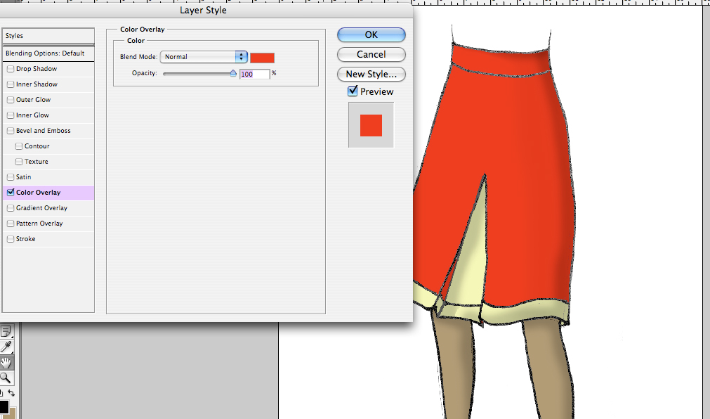
The system always defaults to red. Click the red swatch to choose a new color.
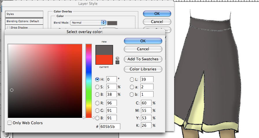
This will bring up the color picker from which you may choose a color you like. I'm going to pick a gray shade.
You can repeat this process with the secondary color. Here, I'm choosing a lilac shade.
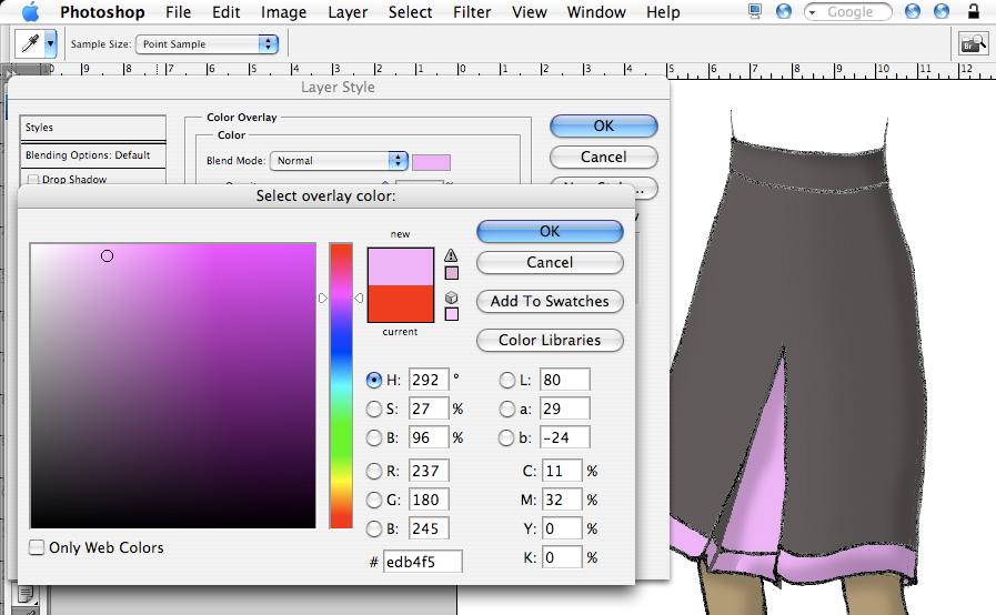
At any point, you can go back and change those colors again, until you find a combo you are happy with.

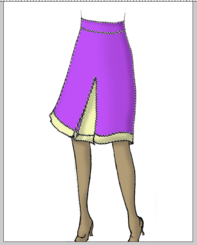
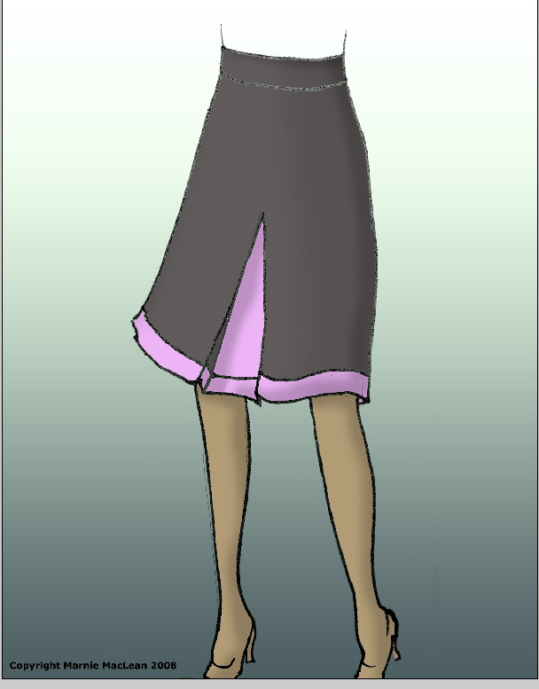
After that, you can apply a gradient to the background, to give the illustration a little depth.
And then, just add your name and copyright info and any further details you wish to point out.
Clearly, this is a very simple explanation. As you add texture and lace, your drawing and its details will become more complicated to colorize. In all those cases, though, it's simply a matter of laying down the color on individual layers. After that, all the shading and color adjustments remain the same. You can also scan in or photograph your swatch and use that to fill in your drawing.
Once again, you can download the original sketch here and the final document here.
I hope you enjoyed the tutorial.
Thanks you so much for this tutorial! I've been trying to learn Photoshop lately and this was super useful!
Have a wonderful Thanksgiving!
oh my word, Girl.
Wow!
I will need to come back to this several times, but I can already see how useful this will be to me
As usual, what a great tutorial! You always give such good tips. Thanks!
Wonderful, as always. I can't believe how many of these you've done! Hope Turkey Day was most excellent. We're doing well, but stinker keeps me busy. I'm slowly knitting a little sweater I designed for him - I think it may take three weeks - amazing what a kid will do to your knitting productivity.
Love, J