All photoshop posts

Can we grep about Photoshop

This is sort of a strange blog post as it's not really knitting related, has no puppies and addresses an obscure problem that most people will never have, but I'm of the mind that if I know how to fix a problem I've had, there's bound to be someone else out there with the same problem so I might as well share.

Our website's online ordering application accesses files stored in a series of folders. Within the folders, all the naming conventions are the same. The folders themselves are all numbered, though not sequentially. We had 1000 folders and within each folder is an image called, "sample.jpg" and each of those images is a preview of the product being sold, so they are all different. We wanted to open all those files and use Photoshop's Save for Web function to optimize them. However, Save For Web doesn't remember the image's source folder. It remembers the last place Save For Web saved to, which means if you were to batch process the images, each would overwrite the last in some common folder. Even if we numbered the images, sequentially, they wouldn't match up with their folder number since the numbers all jump around. Any solution I could think of ended up being pretty labor intensive with plenty of chance for error.

I posted on the Adobe Forums and got bupkis.

I figured I had nothing to lose and posted on Facebook. A few hours later, a friend in Australia had a solution for me.

I decided to do up more detailed instructions, suitable for someone who has never worked with unix, grep, or scripting before. You can download the instructions and sample files from this page. Please note that these are Mac specific instructions. Pretty much everything should translate to some sort of PC equivalent, but I'm not the person to help you sort that out.

I could see this being handy for anyone who has a lot of image files on their site that they might want to resize or optimize, quickly.

If you think any of this would be useful, feel free to download the files and don't hesitate to let me know if you have any tips, corrections or suggestions.

As a freelance designer, I sign a lot of contracts. It's just part of working with businesses on a project by project basis, and about 99% of the time, those contracts come to me as digital files.

I have a fax machine at home, and I could print out my contract, sign it, fax it to the person who needs it, who probably gets their faxes printed out on more paper and then I could wait to get a copy of the version they signed, and file that away, but honestly, that seems wasteful and unnecessarily labor intensive. I'm also partial to storing files digitally so the paper workflow is not ideal. I have enough unsorted clutter in my house.

As a side note, while I'm posting this as a knitwear design tutorial, it really is just a useful thing to know in general. This skill was invaluable when we were buying a house, and again when we refinanced. If you are applying for jobs, filling out contracts, or signing any file you receive digitally, you can use the methods I'll be covering.

In this post, we'll be covering the creation of a reusable image of your signature. Because I'm not completely out of my gourd, I am going to be using a signature of my nom de rien, Lady Awesome Pants, as opposed to my actual real signature, which someone might want to use for nefarious reasons.

In the following posts, we'll discussing using the image to sign your contract.

If you want to play along with the home game, you can download the signature, a sample Microsoft Word contract and a sample PDF contract by clicking the links. You can also download the unretouched scan of the signatures, here.

For this step, you'll need:

  • pen
  • paper
  • scanner or digital camera
  • Adobe Photoshop or photo editing software of choice*

*I'm using Adobe Photoshop CS5 on a Mac. If you are using a different photo editing software, you may need to refer to your user's manual.

Find yourself a good, medium point, dark (preferably black) ink pen and a clean piece of paper (no lines, no show-through from anything printed on the other side) and write your name and/or initials a bunch of times. Try to do this on a surface that's not too hard, a catalogue under your piece of paper works nicely. Press firmly as you sign. You don't want a light whispy signature, you want something clear and legible.
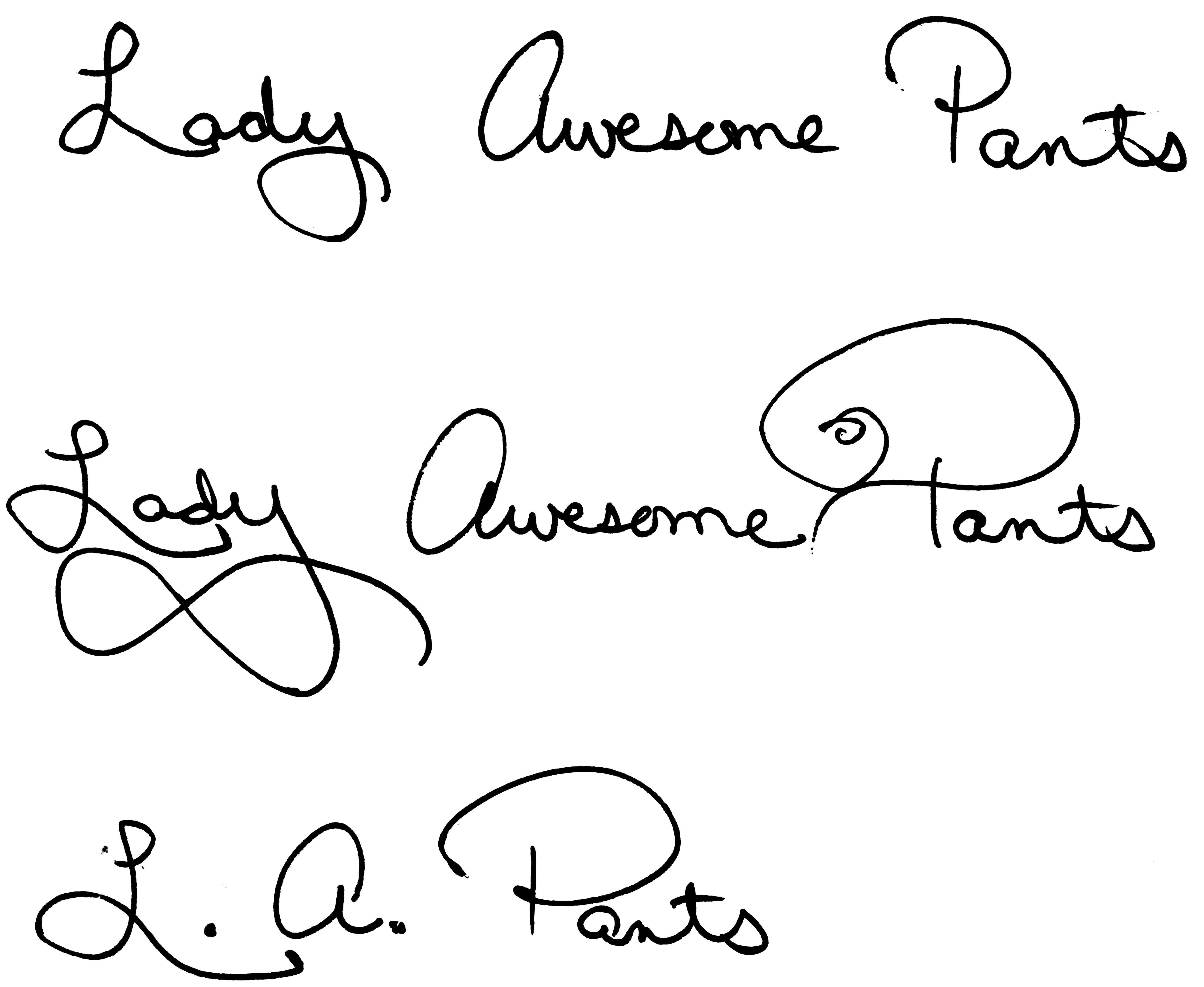
signature samples
Signature Samples

Once you know you have at least a few examples that you like, get ready to scan your page. I usually scan the whole page. Sometimes, it's not until after you've cleaned up the scan, that you can tell which signature will work best. I like to scan at a high resolution, in grayscale, to ensure I get all the detail I need with no unnecessary noise.
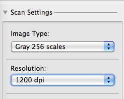

Scanning settings

If you don't have a scanner, you can photograph your signatures with a digital camera, just make sure you do so in good, natural light, on a background that won't show through your paper and that the signatures are in focus.

Depending on your scanner, your digital camera, the lighting, and whether or not you fed your Mogwai after midnight, your digital file may be too dark or too light or otherwise somewhere short of perfection.

Note: If you scanned or photographed your signature in color, convert your file to Grayscale by going to IMAGE | MODE | GRAYSCALE before proceeding.

Scan
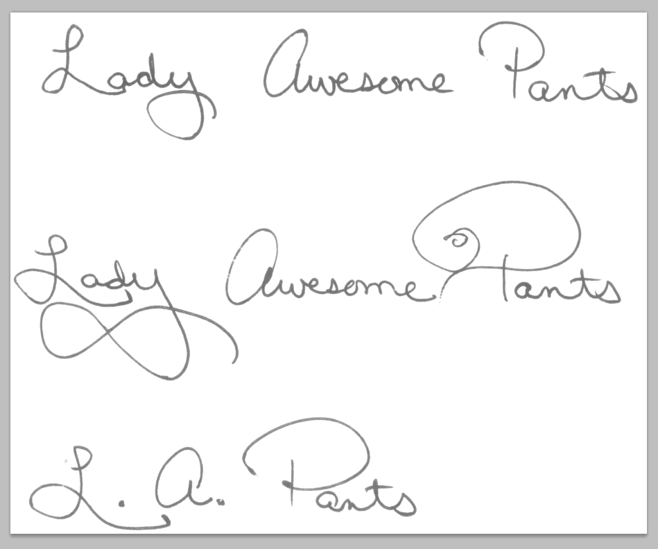
This raw scan is not living up to its full potential

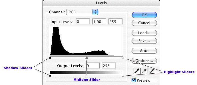
In Photoshop, go to IMAGE | ADJUST | LEVELS

This will bring up a set of sliders that will allow you to clean up your scan. Bring the black triangle as close to the white triangle as possible. That will make everything on the page either pure white or pure black and remove all shades of gray. Play around with moving them more to the left and more to the right. One direction will make your lines appear thicker, the other will make them thinner.

adjust levels
Adjust Levels

Next we'll convert the mode to Bitmap. Your image must already be grayscale for this option to be available. If it's not grayscale, convert it now. Bitmap files are made up of only black and white pixels, no shades of gray, no color. This is a good format for pixel based logos and line art. Additionally, many programs, like InDesign, Quark and other desktop publishing applications, will view the white pixels in bitmap images as transparent, which can be useful with signatures that are supposed to sit on a line. You'll see how this works in the InDesign portion of this tutorial, to come at a later date.

Go to IMAGE | MODE | BITMAP


Convert image to Bitmap
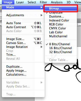
Change Mode to Bitmap

Choose 50% Threshold from the Method drop-down. I like a resolution of about 1200 dpi. I would avoid going below 1000 dpi.

bitmap settings
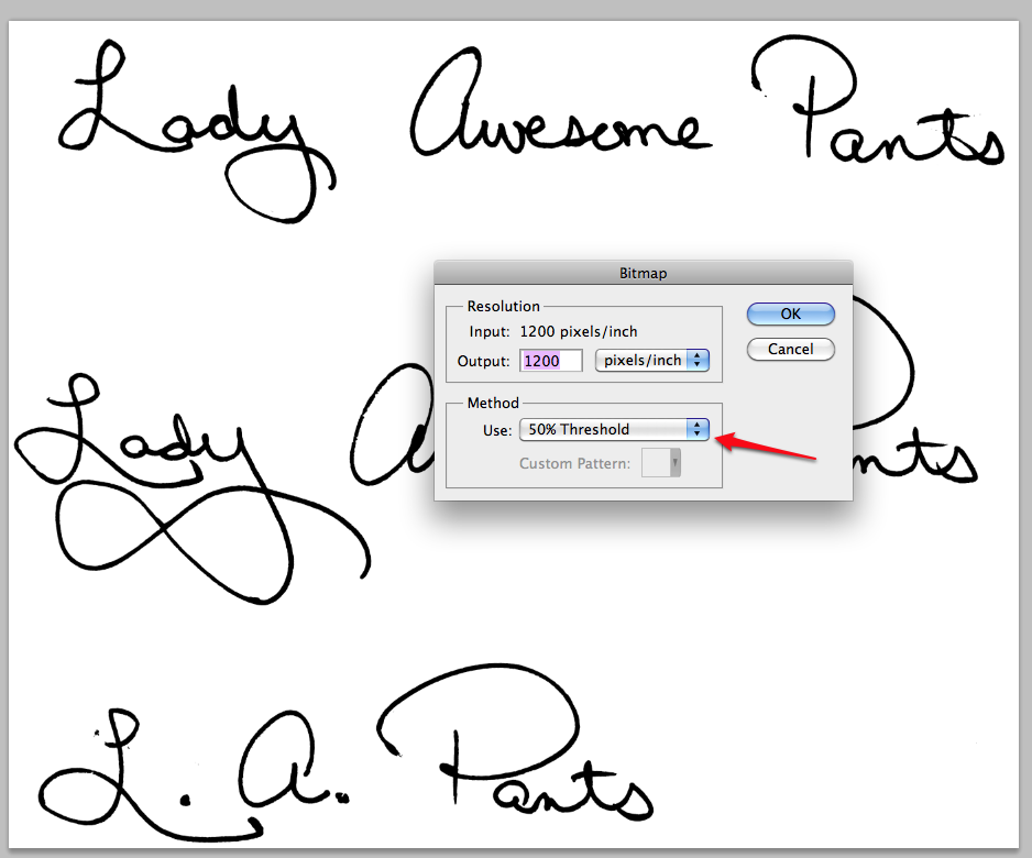
Settings for conversion to Bitmap

If you adjusted your Levels properly, you won't notice much change in your file. If your signature looks too washed out or too blobby (technical term) after conversation, that means you didn't adjust your Levels slider to be close enough together. Simply undo and adjust your Levels further.

If you are happy with the results, you can crop your image so that you only have your favorite signature visible.
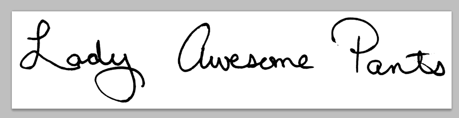
cropped signature
Cropped

Save your file as a TIFF.

Save as tiff

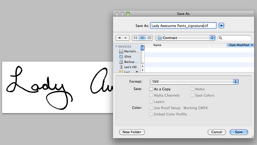
You might be thinking, "But Marnie, what is this TIFF madness of which you speak? Why can't I save it as a JPEG?"

JPEGs do not support the BITMAP format because JPEGs are always, RGB (color) images. So all that work converting to a bitmap, to make a good quality piece of line art, will be lost. It will still work well enough, but if your image software supports Bitmap and TIFF format, that's the way to go.

That's all there is to it. You now have a lovely file of your own signature, that you can use to sign digital files.

In the next tutorial, we'll talk about using the file to sign Microsoft Word documents and in the third and final installment, we'll use this file in InDesign and talk about adding typed text to PDF forms.

Using Photoshop to color your sketches

| 5 Comments

Most images can be clicked to zoom.

Perhaps you need to submit sketches of a pattern for consideration in a publication, or maybe you are just designing for yourself and want to play with color combinations, regardless of your reasons, you don't need a full set of pencils and markers to colorize your drawings and if you use Photoshop, you change the colors over and over again, without having to do a new drawing. I'm going to cover some very simple techniques, that you can build upon to create your own style.

As with all my tutorials I want to make it clear that I'm not an expert, these are just some suggestions. I don't supply support for these methods and cannot offer instructions for older versions or open source alternatives to the program indicated. I am using Photoshop CS3 on a Mac, but will try to provide PC equivalents when I know them.

And, of course, if you have any suggestions, leave them in the comments. I love learning new tips.

Start your sketch

You may download my original, unretouched sketch here, and play along at home. The final document is available here.

I generally do my sketches on paper. I'm not a fine artists, so I often use catalogs as reference for the way clothing drapes and the correct proportions for the human form. I don't like to actually trace images, because I think this looks too stiff. I prefer to just use the image as a visual reference and draw the images by hand. You should do what produces the best results for you.

In this case, I want to draw a skirt. I looked around online and found this cute number over at the Gap. I lightly drew my sketch with pencil then outlined only the most important features with a thick dark marker.

If you have a scanner, great, scan it. I have one but I generally just take a picture with my digital camera, like I have here. The lighting was atrocious that day, so the paper is pretty dark, but that's totally fine.

Now, open the image in Photoshop.

Photoshop Tips II - Levels and Histograms

| 5 Comments

Most images can be clicked for a closer view

In our last tutorial, we discussed Curves. Today we'll be talking about Levels. Levels can be used in the exact same way as Curves, though the interface is a little different. The cool thing about Levels is that you can actually see a visual map of your image and the colors displayed within.

As with the last tutorial, all the caveats still apply. Your mileage may vary. I'm no expert, blah blah blah, color correction is subjective, etc.

I've chosen a photo and opened the Levels dialog box by going to the IMAGE menu, to ADJUST and choosing LEVELS. You can also access this option by pressing [CTRL+L] or [CMND+L], depending on your computer platform.


This picture of Thea seems a little dark in the three-quarter tones (those between the middle and shadow tones). Her face, next to the couch, seems a bit muddled and lacking in detail. When I pull up the Levels palette, I see my impression confirmed. Let's take a closer look.

Click image to see the tonal ranges

Here we see a graph of the distribution of pixels. On the left, indicated by a black slider, is the shadow area of the image. This image has a large majority of its pixels between the midtones and shadows. At the far right, the highlight point shows absolutely no pixels. We don't have any pure white in this image.

From the Layers palette, I can move those sliders, under the graph, to adjust the tones in the image. We have two sets of sliders we can move. The top set of sliders consists of three tonal ranges. On the left, shadows, in the middle, midtones, and on the right, highlights.

The bottom set of sliders has just a shadow and highlight slider.

Most images can be clicked for a closer view

A little caveat before we begin. I'm not a color correction expert, though I do need to know the basics for the work I do. Most of what I've studied has been for print, not for web, though many of the concepts remain largely the same.

Furthermore, images look really different on a Mac than they do on a PC. Most people are on PCs and I'm on a Mac, so while may think a picture looks good on my screen, you might not.

And that brings me to the last point. A lot of color correction is subjective. There are some things that are fairly universal. For instance, a light color cast to an image is usually apparent to most people. but the perfect amount of contrast and brightness may be different depending on personal preference, age and monitor. Did you know that many people's vision yellows slightly with time? Older monitors will often display color much differently than newer models, as well, so there are a great many factors that can impact how you view an image.

Some basic stuff that makes me sound like I know what I'm talking about

While there are quite a few different color spaces, the two you are most likely to deal with and work in are RGB [red, green, blue] and CMYK [cyan, magenta, yellow, black]. RGB colors are those that display on monitors. It's the means by which light produces color. CMYK space is what your home printer generally uses (though some contain additional colors to produce a wider range of shades). If you are familiar with the old color wheel, containing primary, secondary, and tertiary colors, you understand the basics of how CMYK colors work. While the primaries are a little different (not red yellow and blue, but cyan, magenta and yellow,) the way in which colors combine remains largely the same. Add the right amount of yellow the right amount of cyan and you will get shades of green. RGB works in the opposite manner. In RGB, when you have 100% of each color, you get white. Do the same in CMYK you get black. Most of us find this counter intuitive, but when you are making your edits you should not switch to CMYK and back to RGB. You must learn to modify your colors in RGB if you wish to maintain the detail of your image.

I've made this little graphic to help you understand how the RGB colors relate to the CMY colors (don't worry about black)

There are 6 color swatches below. every other swatch is an RGB shade and the alternate are CMY colors. Colors located across from each other are related. When working in RGB, reducing the amount of the RGB shade will increase the CMY shade. For instance, let's say your image has a red cast to it. In some images, this might be interesting, but if you are photographing a lush summer landscape in the day, the red cast will make your gorgeous greens look muddy. Reducing the amount of red in the image will make those greens pop.

So how do you apply this novel bit of trivia? Well, I'm glad you asked. (You asked, right?) I apply this, most frequently in the CURVES dialog box.

Share this page

About this Archive

This page is an archive of recent entries in the photoshop category.

secret book submission is the previous category.

giselle is the next category.

Find recent content on the main index or look in the archives to find all content.

August 2016

S M T W T F S
  1 2 3 4 5 6
7 8 9 10 11 12 13
14 15 16 17 18 19 20
21 22 23 24 25 26 27
28 29 30 31      

Find Me Here

  • rss
  • facebook
  • twitter
  • flickr
  • goodreads
  • google
  • linkedin
  • pinterest
  • ravelry
  • youtube

Featured Patterns