Most images can be clicked for a closer view
A little caveat before we begin. I'm not a color correction expert, though I do need to know the basics for the work I do. Most of what I've studied has been for print, not for web, though many of the concepts remain largely the same.
Furthermore, images look really different on a Mac than they do on a PC. Most people are on PCs and I'm on a Mac, so while may think a picture looks good on my screen, you might not.
And that brings me to the last point. A lot of color correction is subjective. There are some things that are fairly universal. For instance, a light color cast to an image is usually apparent to most people. but the perfect amount of contrast and brightness may be different depending on personal preference, age and monitor. Did you know that many people's vision yellows slightly with time? Older monitors will often display color much differently than newer models, as well, so there are a great many factors that can impact how you view an image.
Some basic stuff that makes me sound like I know what I'm talking about
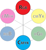
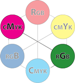
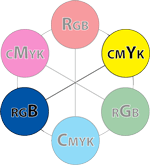
While there are quite a few different color spaces, the two you are most likely to deal with and work in are RGB [red, green, blue] and CMYK [cyan, magenta, yellow, black]. RGB colors are those that display on monitors. It's the means by which light produces color. CMYK space is what your home printer generally uses (though some contain additional colors to produce a wider range of shades). If you are familiar with the old color wheel, containing primary, secondary, and tertiary colors, you understand the basics of how CMYK colors work. While the primaries are a little different (not red yellow and blue, but cyan, magenta and yellow,) the way in which colors combine remains largely the same. Add the right amount of yellow the right amount of cyan and you will get shades of green. RGB works in the opposite manner. In RGB, when you have 100% of each color, you get white. Do the same in CMYK you get black. Most of us find this counter intuitive, but when you are making your edits you should not switch to CMYK and back to RGB. You must learn to modify your colors in RGB if you wish to maintain the detail of your image.
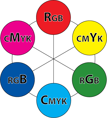
I've made this little graphic to help you understand how the RGB colors relate to the CMY colors (don't worry about black)
There are 6 color swatches below. every other swatch is an RGB shade and the alternate are CMY colors. Colors located across from each other are related. When working in RGB, reducing the amount of the RGB shade will increase the CMY shade. For instance, let's say your image has a red cast to it. In some images, this might be interesting, but if you are photographing a lush summer landscape in the day, the red cast will make your gorgeous greens look muddy. Reducing the amount of red in the image will make those greens pop.
So how do you apply this novel bit of trivia? Well, I'm glad you asked. (You asked, right?) I apply this, most frequently in the CURVES dialog box.
Curves
Before we talk about colors, let's learn the basics of how Curves work.
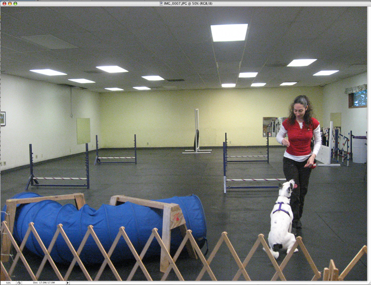
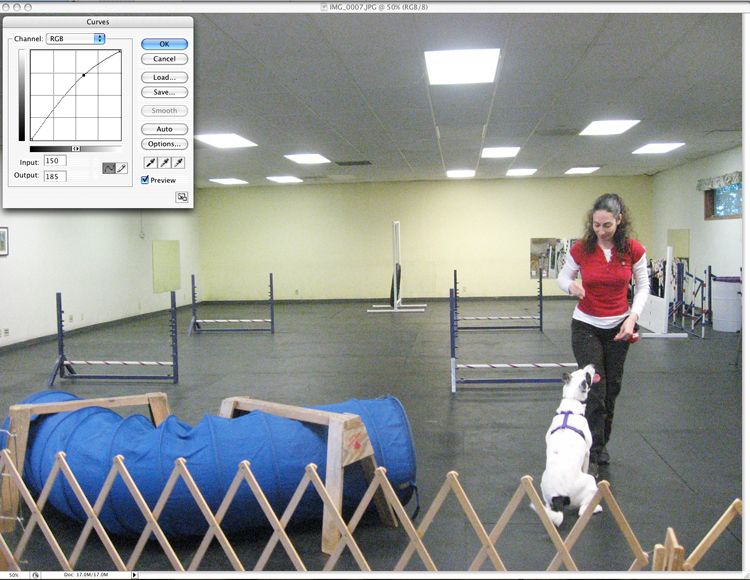
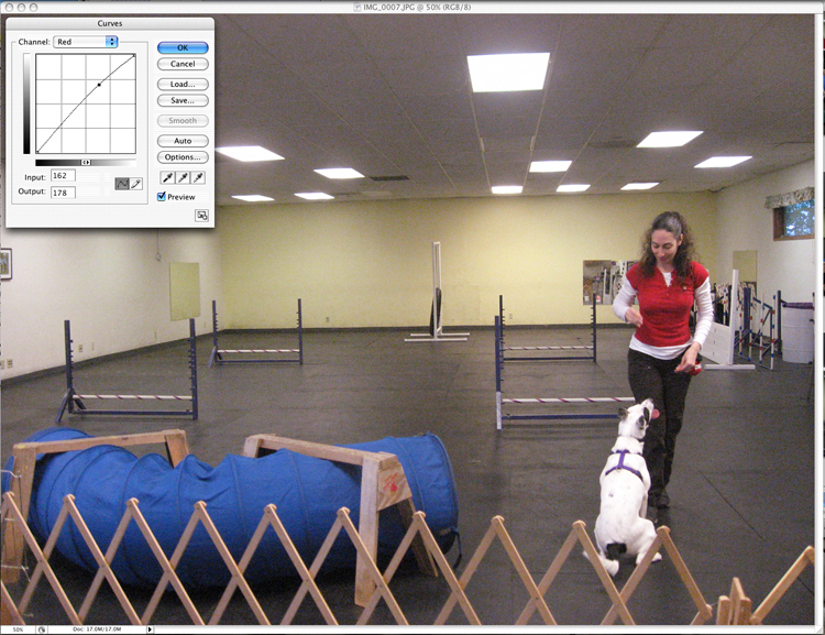
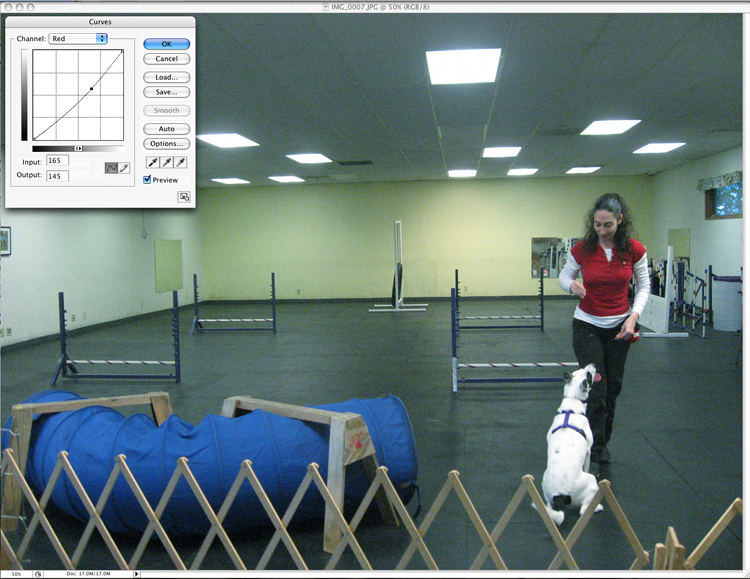
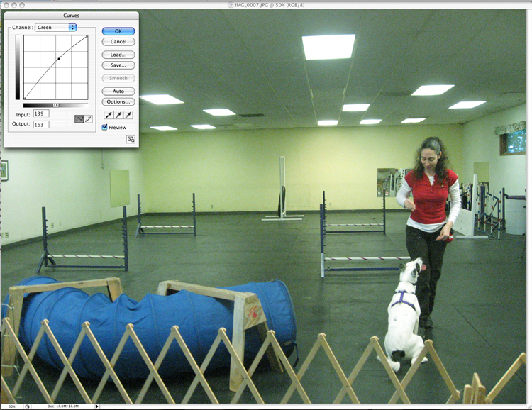
Look at this image of Thea and me at Puppy Agility. I've chosen this image because it has quite a few colors in it already, and the effects of playing with the color, should be more noticeable.
 |
Original Image |
To access the Curves, go to the IMAGE menu, to ADJUST and choose CURVES.
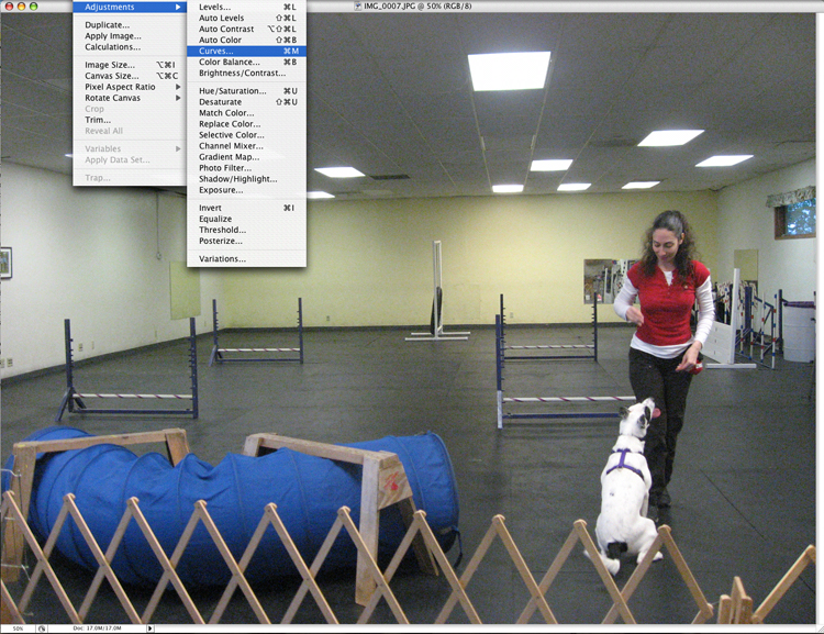
You can also use the quick key, [CMND+m] or [CTRL +m], depending on your computer platform.
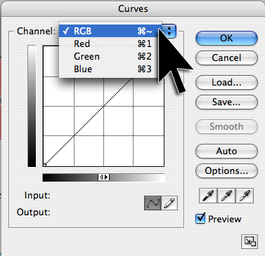
No matter what your image looks like, your curves dialog box will look the same. You will see a gridded square with a straight line running diagonally through it (that's the "curve" though it's straight right now). The default view allows you to change all the colors in the image, uniformly. We are working in RGB, so we see that the pull down at the top of the Curves dialog box says, RGB. It is the item, in the image below, marked "Channel Selector"
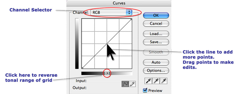
Note the double arrows on the grayscale bar below the grid. Click that to reverse the tonal ranges of the grid. You want yours to match mine. So clicky clicky clicky and watch how those grayscale bars flip back and forth. Weeee! Fun for the whole family.
Ahem
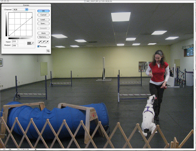
There are two points on the diagonal line already. One is at the top right and the other at the bottom left. These are the highlight and shadow points, respectively. If you do not touch those points, your highlights and shadows will not be effected. Keep those there if you feel that your image doesn't need much of a contrast change.
Lighten or Darken an image
Click somewhere around the middle of the line. A point appears. You can now drag that spot up or down by clicking, holding and dragging. Watch what it does to the image.
|
Original Image
|
 |
 |
| Dragging the point upwards lightens the whole image without losing your shadows. Note that my hair, pants and the shadow on the tunnel are all still nice and dark, yet the overall image is much lighter. I find that many images benefit from being a little brighter. | Conversely, dragging the point down darkens the images,
without losing the highlights. This image shows just that. Thea and my
shirt still look white, not gray, but the overall image is much darker. |
Changing the contrast of your image
Maybe your image isn't just too dark or too light, maybe you have too much or too little contrast. The rule for curves goes as follows:
The steeper the angle the greater the contrast.
With that in mind, let's look at a couple of examples.
Reducing the contrast of an image
|
Original Image
|
 |
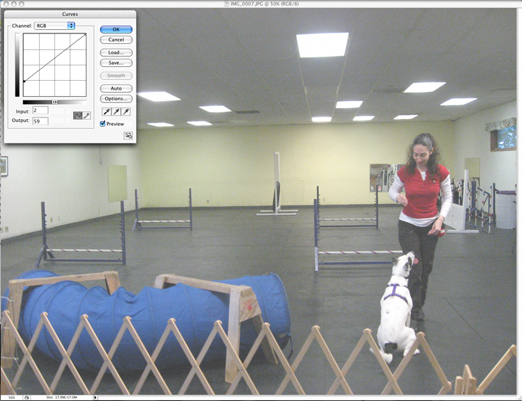 |
| To make an image darker and less contrasty, move the top point down. The angle of the line becomes less steep and by moving the top line down, you are darkening the overall image. | To lighten the image, move the bottom
point up.The line becomes less steep and the overall image is lightened.
Doing this produces a highkey image and gives an etherial effect.
|
Increasing the contrast in an image
As I stated above, you adjust the contrast by manipulating the curve to be more or less shallow. To increase contrast, you'll want to make the angle of the curve steeper.
|
Original Image
|
 |
 |
| To make the image darker and increase the contrast, drag the bottom point to the right. The lights, my shirt and Thea all remain bright white, but the image has much more contrast and appears darker overall. | Drag the top point to the left and the
image becomes much brighter without losing the deep shadows in my pants,
Thea's spots, and on the tunnel.
|
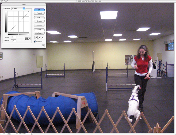
Adjusting color in an image
We have been working with with all the colors in the image, at once, in the above examples. But there will be times when you only want to adjust certain colors. I use the following technique when photographs of my yarn do not properly approximate the real color.
To adjust specific colors, you'll need to switch from the RGB area to the individual channels. To do so, click the word RGB, above the grid. Select the channel you'd like to modify.
From here, all the techniques we've covered above will still apply. The darkest parts of the image are changed by moving points at the bottom and left of the image. You can adjust lighter colors by modifying the top right corner of the curve. The effects will produce more contrast where the lines are steeper and less where they are shallower.
We'll go through each channel in order, starting with Red.
Red and Cyan
 |
Red and Cyan
|
 |
 |
| In the red channel, pulling a center point up, will increase the red throughout the image. If your purples look too blue, or your reds aren't popping, you can increase the red in the red channel | If want to reduce a red cast, do the opposite.
This is very effective in making greenery look greener, and is also effective
if your blues look too purple.
|
Green and Magenta
 |
Green and Magenta
|
 |
 |
| Pulling up and left on the green curve will increase the greens of the image. Paired with reducing the reds (shown above) can improve the look of greenery. | Pulling out the green from the image will
increase the magenta. Oranges, reds, and purples may all be improved
with this modification.
|
Blue and Yellow
 |
Blue and Yellow
|
 |
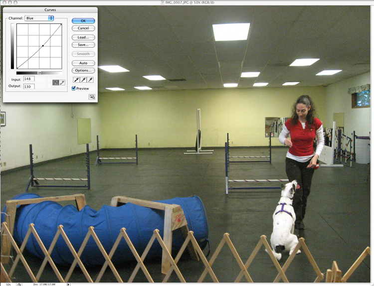 |
| Increasing the blue in an image, when done delicately, can reduce the effect of indoor lighting. Overdoing it, as we have in this example, can give a slightly clinical effect, but in small quantities is can be quite nice. This is also an excellent tweak for taking the yellow out of a white dog's coat. | Add more warmth to an image by reducing
the amount of blue, thereby adding yellow. This will also really improve
orange, yellow and red shades.
|
Conclusion
All the effects I've shown above can be done with a multitude of tools, available in Photoshop. There are specific Adjustment options for Contrast and Brightness, Hue and Saturation, and Color Balance. If those tools work better for you, use them. I personally like to use Curves because you can do so much in a single tool. The more you play with your images, the better you will get at detecting contrast and color issues. Most of us can visually detect a problem, even if we cannot verbalize what is wrong, so using something like the Curves palette, gives you the chance to play around with all of these changes and see what works best.
The above examples are very extreme shifts to give you a better understanding of how the changes effect the image. Make very slight changes, bit by bit, until you hit that sweet spot.
Curves can do so much more, but I'd need to write a whole week's worth of posts to cover even the small subset of knowledge that I have. If you do have any specific questions or if you want to add your own suggestions, please leave a comment.
In the next Photoshop tutorial, I'll be talking about Histograms and Levels.
Awesome tutorial, Marnie!! I'm going to try it out on Monday when I get to work. I know I will be using this!
this is a GREAT tutorial, Marnie!I always use curves when trying to improve the quality of a picture, but (embarrassingly) I never knew what I was doing, I just played around until it looked good. Now I know!
p.s. I emailed you about your comment issue - I had a similar issue to you, and I found a solution.
Thanks for taking the time to show us all of that! I've had 2 Photoshop classes in my web graphic design curriculum and I don't think we ever even explored the curves tool.
Very cool. Got more good info today than in 2 semesters of school!
Fantastic tutorial! I'll be going over this a few times. Thanks so much.
Great post, Marnie! A few things I'd add for web production--RGB--exclusively:
1) Regardless of the brand, calibrate your monitor at least once a month, especially if you're correcting images for print.
2) Adjust Photoshop's color settings to a specific profile. For Mac, leave it at Adobe RGB 1998 and convert any working files to that color space. Leave the rest alone.
3) Make the adjustments on a separate layer from the original image. That way, if you want to go back and make a different correction, you don't have to make a separate file, it can just be a separate layer in the same file. I know Marnie knows this, but here it is to those who don't:
a) Open up your Layers palette (F7). You will see your original image there as "Background".
b) At the bottom of this palette you'll see a number of icons. The color adjustment icon is the circle that's half white, half black. Hold your mouse button down on this icon; a menu pops up; select Curves. Curves becomes its own layer, which you can turn off and on at will so you can play around with other adjustments.
c) Save file as .psd.
d) Save file for web.
4) Like Marnie said, there are so many details linked to color correction I'd love to add (but I'd hijack her comments in the process). The best thing for anyone with the program to do is to experiment on your own and find online tutorials. But. It's always best when you have a good photograph to begin with. Work on the photo skills too!
Watching for info on Thea-how's the puppy?
Thanks so much! What a super tutorial! I can't wait to go home and play! :)
Thank you very much!