Most images can be clicked for a closer view
In our last tutorial, we discussed Curves. Today we'll be talking about Levels. Levels can be used in the exact same way as Curves, though the interface is a little different. The cool thing about Levels is that you can actually see a visual map of your image and the colors displayed within.
As with the last tutorial, all the caveats still apply. Your mileage may vary. I'm no expert, blah blah blah, color correction is subjective, etc.
I've chosen a photo and opened the Levels dialog box by going to the IMAGE menu, to ADJUST and choosing LEVELS. You can also access this option by pressing [CTRL+L] or [CMND+L], depending on your computer platform.

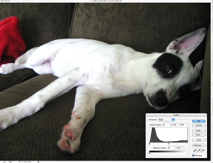
This picture of Thea seems a little dark in the three-quarter tones (those between the middle and shadow tones). Her face, next to the couch, seems a bit muddled and lacking in detail. When I pull up the Levels palette, I see my impression confirmed. Let's take a closer look.
 |
Click image to see the tonal ranges |
Here we see a graph of the distribution of pixels. On the left, indicated by a black slider, is the shadow area of the image. This image has a large majority of its pixels between the midtones and shadows. At the far right, the highlight point shows absolutely no pixels. We don't have any pure white in this image.
From the Layers palette, I can move those sliders, under the graph, to adjust the tones in the image. We have two sets of sliders we can move. The top set of sliders consists of three tonal ranges. On the left, shadows, in the middle, midtones, and on the right, highlights.
The bottom set of sliders has just a shadow and highlight slider.
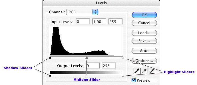
Rules for using the top set of sliders
- The closer the sliders are together, the great the contrast.
- Moving the shadow and midtone slider right will make the image darker and increase the contrast
- Moving the highlight and midtone slider left will make the image lighter and increase the contrast
- Moving just the midtone slider left will make the image lighter without changing the highlights or shadows
- Moving just the midtone slider right will make the image darker without changing the highlights or shadows
These changes are identical to those we learned about in the Curves tutorial, under the sections titled, Lighten or Darken an Image, and Increasing the contrast in an image.
Rules for using the bottom sliders
- The closer together the sliders, the less contrast in the image
- Moving the shadow slider right will make the image brighter and reduce the contrast
- Moving the highlight slider left will make the image darker and reduce the contrast
These changes are identical to those we learned about in the Curves tutorial, under the section titled, Reducing the contrast of an image.
Editing the individual Channels
Please refer back to the tutorial on Curves for an explanation RGB and CMY color. You may edit the color casts Channel by Channel in the Levels palette, just like you could in the Curves. Instead of pulling the midpoint of the Curve up or down to increase or decrease the color, you'll move the midpoint slider left and right. Otherwise, the concepts are the same.
Be careful how much adjustment you make
This is actually true of both Curves and Levels. Whenever you make adjustments like this to your image, you deplete the quality of the image. In my last tutorial, MJ left a great comment with some additional tips and two, in particular, bear repeating.
- Don't edit your original image. Always work from a copy. This way, you can always go back if you really mess your image up.
- Consider using Adjustment Layers. They work just like these image adjustments, but they appear as layers and can be edited over and over without depleting the quality of the image. You only apply those changes when you export your image for web.
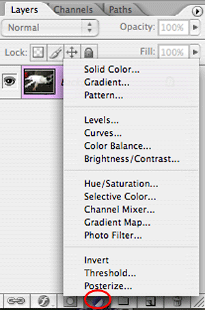 |
| Find Adjustment Layers in the Layers palette. Click the icon circled above and select the type of adjustment you wish to make. |
Back to our sample image.
Let's see what happens when I make a change to the Levels. Below, I've dragged the highlight slider to the left to brighten the whole image.

After applying the change, I can open the Levels palette again. For those of you with newer version of Photoshop, you can also access the Histogram palette from the Windows menu.
Let's take a close look at the new Histogram.
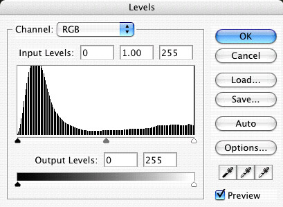
Do you see all those white bars through the Histogram? Those are tonal ranges that are absent from the image. This amount is probably imperceptible to most people, but great gaps would produce a posterized effect which looks a lot like a paint-by-number image. Instead of smooth transitions between colors and tones, there will be stark lines of delineation.
Adjusting a backlit image
Backlit images need extra help in Photoshop. Even when the tonal ranges of the image are largely balanced, the image will appear too dark because the subject matter is not sufficiently lit.
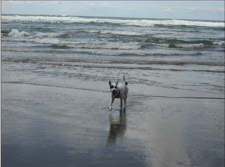
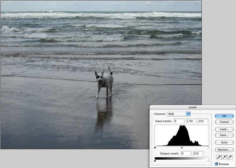
This image of Thea is a good example. Not only is it crooked (wel'l fix that too) but being backlit, the shadow values are fine but the midtones and highlights are really murky.
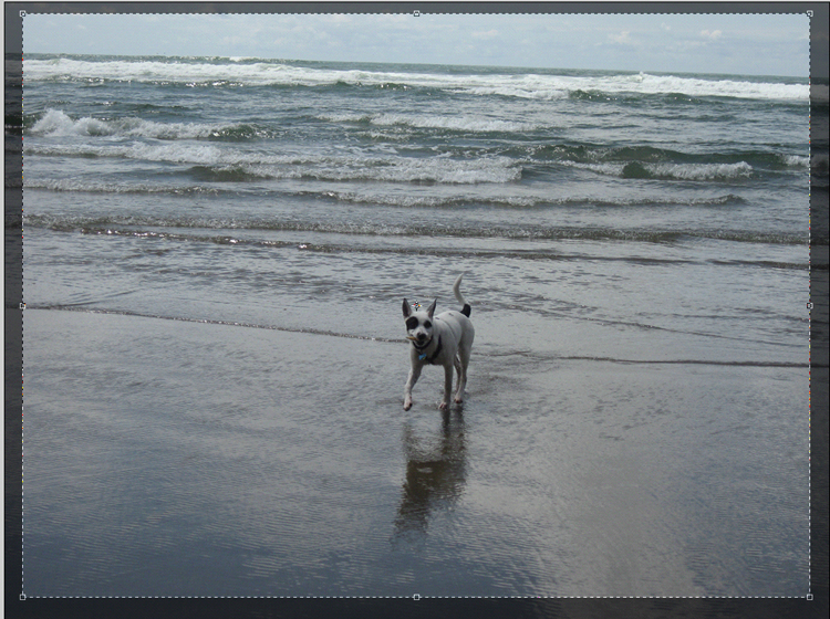
Let's start by cropping this picture. Click the crop tool. Make sure that the PERSPECTIVE option is turned OFF in the Options palette. If you don't see it, go to your WINDOWS menu and choose OPTIONS.
Note: Older versions of Photoshop did not have an Options palette. If that's the case, don't worry about Perspective. It's not an issue.
![]()
![]()
With your crop tool selected, drag a rectangle over your image.
Move your cursor to one of the corners, carefully inching it until it turns from an arrow to something sort of like this. 
Click and hold while you rotate the crop box.
I generally use the horizon as my guide. You can drag the entire crop box down to whatever you are using for a guide and adjust your rotation until it's just right.
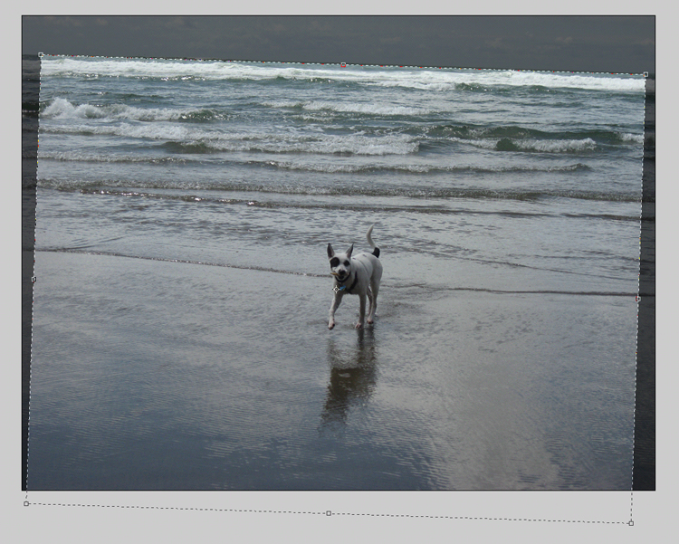
When you are done, just drag your box back into place and adjust the corners so that they do not sit outside the edges of the image.
Press Return to apply the change.
Open the Levels palette.
Why Auto Adjustments don't always work
Sometimes, simply clicking Auto will do the trick for the purposes of posting to the web. However, there are many times when it will actually make an image look worse.
Looking at our histogram, we see lots of pixels in the quarter to three quarter range but very little in the shadows and highlights. I tried selected "Auto" from the dialog box and it resulted in a very contrasty but still very dark image.
The white of the waves were set as the highlight, while Thea remains dark. This is the weakness of the Auto option. It can only evaluate the pixels, not the subject matter.
Manually adjusting the image in the Levels Palette
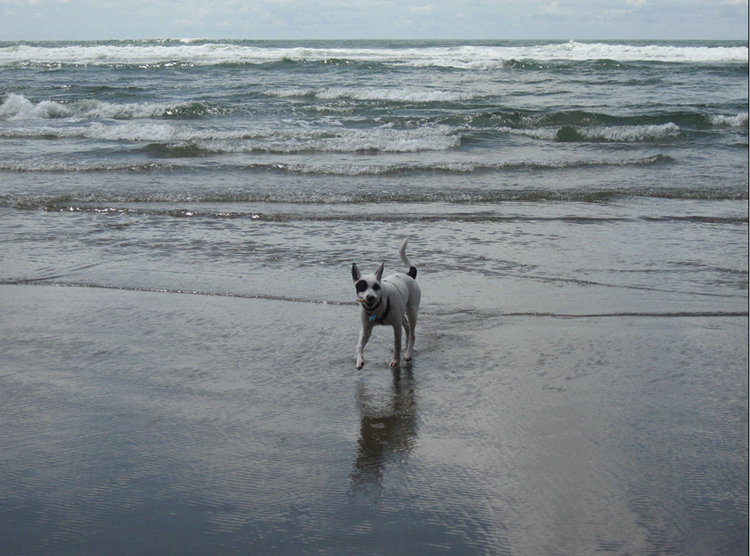
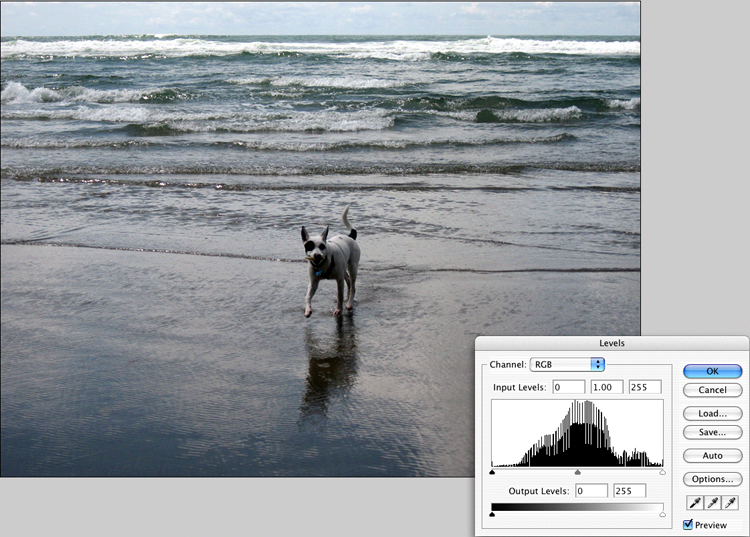
Let's click Cancel to undo the Auto adjustment and go back to the Levels palette. Assessing this image, I really don't need much in the way of additional shadow tones. I still want Thea's spots to be black. However, the midtones and highlights are really too dark.To adjust for this, I'll move the top highlight slider to the left which will also move the midtone slider. This has the effect of brightening the whole image while maintaining the shadows.
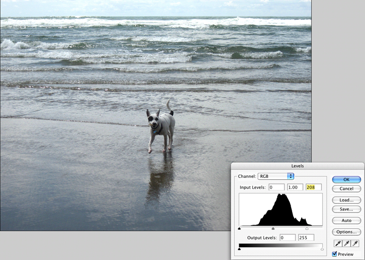
I am still finding Thea and the ocean a little bit dark so I'll move only the midtone slider to the left a bit more.

Now the image looks more like I remember the live scene.
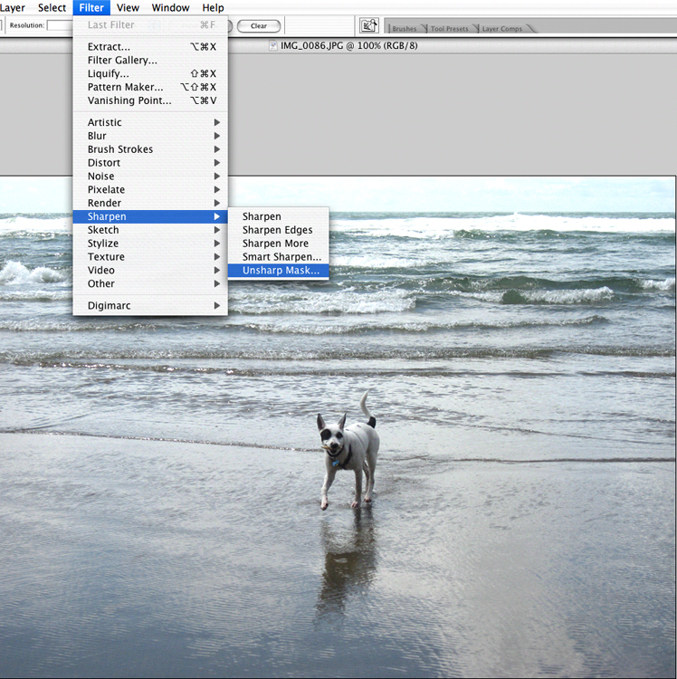
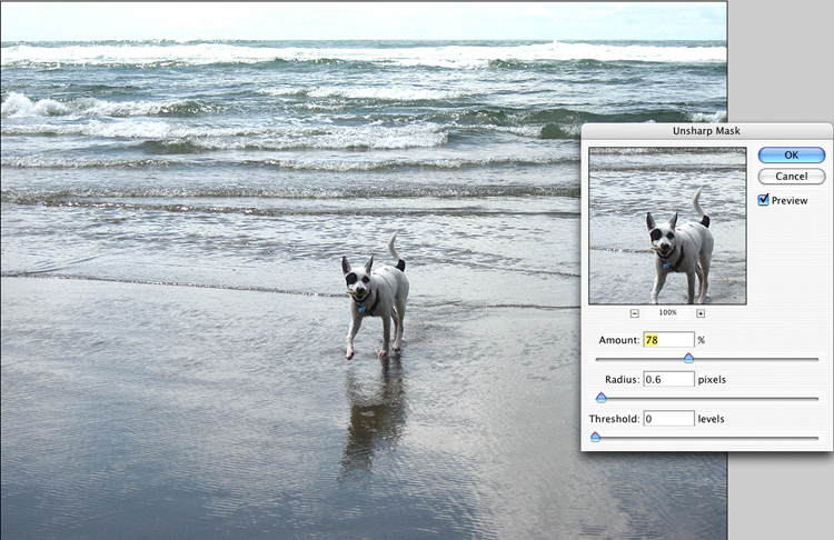
There's one more step that will bring out the details and add a bit more interest to the image. I'm going to apply UNSHARP mask to the image.
Unsharp mask
Yup, Unsharp is a means of sharpening. It seems like some sort of oxymoron but its one of those old darkroom terms that has found its way into the digital world. At some point, photographers discovered that if you blurred a positive of an image and paired it with the negative and shot a new positive, the slight halo formed by the blurry positive, around the various edges in the negative made the details appear sharper.
To get to the Unsharp Mask filter, go to FILTER, choose SHARPEN and click UNSHARP MASK.
Sharpening tips
- Sharpen the image when it is at the actual size it will be used.
- Make sharpening the last step you do before exporting your image for the web.
- If you begin to see noticeable borders forming around details of the image, you've applied too much Unsharp Mask.
- Generally speaking, if you apply more Sharpness, you should apply less Radius.
- If your image is very grainy, increase your Threshold to avoid emphasizing the graininess.
There are no hard and fast rules about sharpening, and your numbers will change based on the size of the image and how you will output the image. Luckily, your output for these images is the web, so your eyes are your best tool.
Unsharp mask will tend to increase the contrast in an image and over using it can actually change the color and brightness. Use your powers for good, not evil.
Export for Web
The last step before sending your image off to the world wide web is to optimize it. Photoshop has a built in tool called, Save For Web. To get to it, go to the FILE menu and choose SAVE FOR WEB.
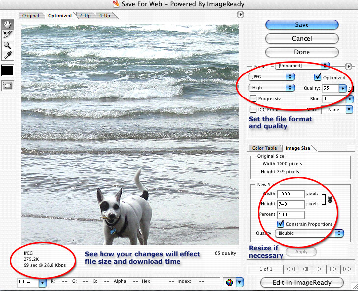
Set your file type (generally JPEG for photos and GIF for logos, cartoons, and other graphics with lots of flat colors), your image size and your image quality. Note how this effects your file size. You are always trying to find the balance between file quality and size/download time. When you've chosen your settings, click SAVE and you will be able to save a new copy of the file for use on your website.
Next up
I'll be doing one more of these Photoshop tutorials, unless people out there start requesting other topics.
The last tutorial will cover lower light images and Hue and Saturation.
Once again, comments with suggestions, questions and ideas are welcomed.
Quick point: to keep the contrast problems down with Unsharp Mask, increase the Threshold number. This can negatively influence the sharpness of the new image somewhat, but it provides a better picture than any other sharpening option I've found in PS.
I've really enjoyed your two Photoshop tutorials. I have it, and I use it, but I've never had any training with it, so some of the things you've mentioned have helped me understand what I should be doing better. Thanks!
ooh thanks for the tutorials (i've been catching up on my blog reading)
I use the free program The Gimp for my photos, but I think this info will still apply. Thanks for yet another detailed tutorial.
Are you going to OFFF?
Thank you so much I'm really learning a lot from you! :)