Today's post is going to be a little technical but I hope it will help people choose the best file formats for their graphics, charts and other visual elements in their patterns. As always, this is based on my own experience and the software that I have available to me, on the operating system that I use. Don't be afraid to question any of this and run your own tests. If you are printing your patterns through a professional printer, be sure to ask them what settings and file formats they recommend.
A little background. Skip this if you are in a rush.
In the mid 90s I was working at the Boston Globe in the Advertising Production department and, despite the fact that newspapers may be one of the slowest industries to embrace new technology (ask me about Atex sometime) we had begun to accept PDFs from customers sending in their ads. In the time after x-acto knives and real dark rooms, but before the invention and wide acceptance of PDF technology, departments, like the one in which I worked, kept Macs and PCs running PageMaker, Quark, Illustrator, Freehand and often a few more obscure layout programs, in various versions to accomodate the vast variety of files that might come in from customers. Even if we had the software to open someone's file, we still had to contend with the fonts. Oh the fonts. PC fonts wouldn't run on Macs and vice versa (still the case for most older fonts, but OpenType fonts are now cross-platform), the fonts from Company A might conflict with the version from Company B, already running on that machine, and all of this was before the ad ever hit the RIPs. These were the hurdles we faced in ensuring that the advertiser's ad looked the same when it left their computer as it did when it printed out on that dingy newsprint, a few days later. Even if the advertiser had the forethought to send an EPS file, there was still a strong likelihood that some percentage of the files would have font problems, and worse, once in EPS format, there was little we could do to resuscitate the ad if there were a problem.
I realize to the younger amongst you, that all this sounds a bit old fashioned and silly. One might wonder if I also had to walk six miles, uphill, both ways, in the driving snow, in my bare feet, just to get to work. To you I say, "pull up your pants, get a haircut and get off my lawn."
But in all seriousness, the PDF file format was a huge boon to publishers like newspapers. Finally, an entire ad, built in any program, on any operating system, using any fonts, could be delivered to a printer anywhere and the printed file would look just like it did back at its birthplace. Even the company using Ventura Publisher and their own custom made fonts, was able to get great results from anyone printing their files.
Knit and crochet designers have benefited from this technology too. Not only can we provide customers with a file format that can be opened on just about any computer using, a free application, but we can be sure that the text will look and flow the same way wherever the pattern is viewed or printed. I don't think it's hyperbole to state that, second to the internet itself, the PDF file format is one of the primary reasons it is so easy for independent designers to self publish.
Why offer this tutorial?
For the purposes of this tutorial, I want to talk about choosing the right file formats for your images to produce the best results in a printed PDF, while keeping your final PDF file size as small as possible. The end result should be a PDF that doesn't take too long for your customer to download but produces great results on their home printer.
Raster and Vector
Your images will fall into one of two categories; raster or vector.
In the simplest terms, raster images are made up of pixels like a mosaic. The more you zoom into a raster image, the more evident those pixels are, until you reach a point where all you see are boxes of color.
Zooming in on a raster image lets you see the individual pixels that make up the whole.
The more pixels in your original image the more leeway you have to zoom in and crop your images. The cost of those extra pixels is file size. Raster images include file formats such as TIFF, JPEG, PNG, GIF, BMP and many others. Any sort of photo or scan will be a raster image.
Vector images, on the other hand, are defined mathematically and because of this, can be scaled up or down infinitely, without any loss of quality.
Zooming in on a vector image, produces clear curves and lines at any magnification.
Text and artwork made up of crisp lines (sometimes called lineart,) should generally be rendered as vector images because the resolution required for these to print crisply and cleanly as raster images is far higher than the resolution required for, say, a photo. It can be done but it's not a great solution for your customers with slow internet connections. The downside to vector graphics is that they have to be built somehow. Programs like Illustrator do this beautifully, but there's a bit of a learning curve and they, of course, require that you have the artistic ability to render your intention.
For the most part, you are going to be stuck with raster format, whether you like it or not, for anything you must photograph or scan. Project photos, step by step tutorials and hand drawn sketches will be raster images unless you have the ability and desire to trace them as vector images in an appropriate program.
For charts and schematics and anything containing text (such as a chart legend, table and logos) I would strongly encourage you to use a vector format such as native Illustrator, EPS, PS, or PDF. Note, however, that any of these file formats may also contain raster elements. Just the fact that something is one of these file formats, doesn't make them vector. The program in which the image is made, and the manner in which you saved the image will determine if you get vector or raster information.
How does this apply to designers?
You've just spent hours building a chart or schematic in Excel or Knit Visualizer or Illustrator or some other appropriate program, and you want that crisp, beautiful graphic to look just as crisp and beautiful when your customer views it in print or on the screen and you want to do this without forcing them to wait 3 hours to download the pattern over a DSL connection.
Using Raster Images in PDFs
For those of us lacking high-end photography and scanning equipment, JPEG is the most common file format. Unless you are planning to offset print your photos or run them in high quality magazines or books, it's unlikely that your photo, being of sufficient resolution and captured in good natural light without a lot of unnecessary monkeying around in photo editing software, will suffer for being a JPEG instead of another file format. The photography purists out there will balk, and their eye may be good enough to tell the difference, but for patterns printed on a the average person's home printer, JPEG is an acceptable file format for pattern layout.
If you are planning to do some substantial color correction or other photo manipulation, I would opt for EPS, TIFF or native Photoshop format when the time comes to save your work. JPEG does some fancy footwork to reduce file size, while these other file formats will retain more of the original photo's information and support extras such as layers and clipping masks, should you need them.
For most home printers, a resolution of 300 dpi at the size used in the layout, will be more than sufficient. If you are going to use your image in the layout, at around 3" without cropping at all, then you'll want your image around 900 (300 dpi x 3") pixels wide or larger. Adjust as needed for cropping and resizing. When in doubt, more resolution is better than less.
Using Vector Images in PDFs
Here is the bigger issue, because just about every program can spit you out a raster graphic and, in a pinch, one could simply make a screen capture of their hard work and call it a day. I won't tell you that you can't get successful results using PNG or JPEG for your charts and schematics, but you do so at the cost of a lot of extra bulk in your PDF.
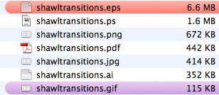
You wouldn't guess it from your original image files, though. I saved my Tolovana charts in a variety of file formats, both vector and raster.
That vector EPS file is pretty big, in fact it's bigger than any of my entire pattern PDFs currently in my collection. The GIF file on the bottom is absolutely tiny by comparison. But you don't send the individual pieces of artwork directly to your customer and once that artwork is embedded in a PDF, you might be surprised by the results.
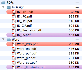
The InDesign PDFs were created using the predefined PDF/X-1a:2001 Distiller settings. The Word PDFs were created using the built in Mac OS option from the Print menu. Word does not support using PS files in layout so I used a PDF instead. As you can see from the list, the big resource hog is the 300 dpi PNG file which will produce visually low quality charts in the pattern. On the other hand, using a vector graphic in either layout program, saves a substantial amount of space in comparison and offers exponentially better quality.
How do I make a vector versions of my chart or schematic?
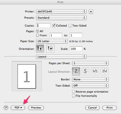
The answer to this question can vary depending on the program(s) you are using and the operating system on which it runs. For the Mac users out there, the various versions of OSX have a built in PDF writer right in the Print menu, no extra software needed.
Whether you are working in a spreadsheet program or special knitting/crocheting software, you should be able to simply print a PDF file which can be placed directly into newer versions of Word and many of the higher end layout programs. Refer to your user's manual for details.
If you own a full version of Adobe Acrobat, it will come with a program called Distiller, which will allow you greater control on a Mac or PC, in creating PDFs either directly from the print window, using an Acrobat PDF driver or by running a PS or EPS file through Distiller directly. You'll want to refer to the user manual for more details on using the full version of Acrobat.
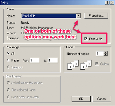
For those of you on older Macs or a current PC not running any PDF software, you'll want, once again, to go to your Print menu and then use the Save to File feature which will produce a PS or EPS file depending on your system's configuration and your print settings. Be aware that Word doesn't support placing PS files as images, so you may need to run your PS through a PDF maker. Check online for free PDF file creating utilities and applications that are compatible with your OS.
Synopsis
Charts and schematics, especially if they contain numbers or other text, should be saved directly from their native application into a vector file format such as EPS, PS, PDF or AI. These produce the best screen and print quality and are comparatively small files in the finished PDF. Most home computers can output one or more of these file formats directly from the Print menu.
Photos and scans should be around 300 dpi at the size they are used in the layout. JPEG is acceptable for most home printing needs, however, technically speaking, TIFF and EPS are considered a better option.
GIF and PNG formats are really meant for web use and are not ideal for layout purposes. If you must use them, higher resolution is your better option but they may give you unnecessarily bulky final PDFs.
Stuff I haven't covered
If you've made it this far, you have geeked out to a greater degree than I would have guessed. It's worth noting, though, that this is really just the tip of the iceberg and there are many more factors involved in refining your image file format choices and PDF settings. I'm not able (nor, in many ways, qualified) to cover that breadth of information but I think what's covered here will give you a solid foundation for making better choices in the future.
If you have questions, corrections or hints, feel free to leave a comment. A big, "thank you," to Julia for getting me thinking about this topic.
Hi Marnie
Your post took me back - I used to work in newspapers in London where we used Hastech, then latterly Atex. Ah... those were the days! (Do you know what became of Hastech?)
I found your post really interesting - I often have to grapple with creating pdfs and keeping file sizes down (nothing to do with publishing patterns) so I now have a few pointers to think about.
Love your blog (and your 3 beasties!)
Pam
Hi Marnie,
Thanks for all the detail. I'll be referring to this article again.
Whew! And you think you're old technologially speaking! I gave up reading halfway through!. I can type. I can send emails. I can use the internet somewhat incompetently to find information and I can make plane reservations. But I grew up when my university classmates who were in the engineering school were carrying around boxes of punch cards and getting into trouble if their programming caused an all night "loop" in the computer which filled the entire basement of the engineering school. Reading this blog was like having to learn another foreign language but without the advantage of at least knowing the topic! Four languages are enough. I leave this one to you! Ouch! ;)
Marnie, I lurve you. Thanks for this thorough tutorial!
One of the biggest issues I have with some designers' pattern PDFs is that they have captured their charts as raster images, and compressed them to low quality. More than once I've recharted an entire pattern so that I can read it easily while knitting! I hope this post gets lots of attention in the knitting blogosphere!
Thank you for this post. I'm in the process of purchasing new pattern layout software, and once it arrives I'm going to start the process of re-doing ALL my designs. This subject could not have been more timely!
How did I not know you were in Boston at one point? I wonder if I would have gotten on this design path if I didn't have the graphic design background I have. PDF is such an amazing technology! Thanks for sharing.