This blog has moved

The blog can now be found here, including all the archives and tutorials. Subscribe to the RSS feed here.

Main

design Archives

February 22, 2007

Tutorial - Using Excel to design colorwork

This entry has also been posted at the Create Along

Today, my intrepid reader, I hope to offer you some tips on using Microsoft Excel for designing colorwork. This will be a long and picture heavy post, so I hope you'll bear with me. Later, I will do a tutorial on designing stitch pattern charts in Excel. I am currently using Excel X for the Mac. I will do my best to provide instructions that can be used cross-platform and with older versions of the software, but your results may still vary. I've enlarged the cursors throughout, to make the actions more obvious and most of the images can be enlarged by clicking on them. Still, if you hit a snag, just drop me a comment or email and I'll try to help you out.

Many moons ago I bought a cute fair isle sweater. It was inexpensive but very cute, fit well was exceedingly warm. Unfortunately, she found her way into the wash and was never the same.

Sweater I bought and subsequently sent through the wash

Having escaped the drier, the sweater still fits but the fair isle portion pulls in and causes a weird a-line shape to the piece that is no longer flattering. I've been thinking I would like to reknit it, someday, using the same pattern, but perhaps some different colors. Excel can be a fun way to play with this idea.

Continue reading "Tutorial - Using Excel to design colorwork" »

June 28, 2007

Using Excel to aid in writing multi-sized patterns

This entry also posted at the Create Along.

Download the spreadsheet and play along at home.

It's been a while since I've done a tutorial and seeing as I use this technique all the time, it's about time I shared it with all of you. This also makes me feel better about the fact that I do not have any updates on my CAL project to post, as my deadline pieces are all keeping me busy.

NOTE: The attached spreadsheet is just a sample and contains measurements that may be useful but which may not meet the standards for some publications. You are welcome to use what I have for your own design purposes but it'll be you who has to ultimately support any patterns written from it, so do your research first.

The goal

Excel can be used to help you organize and plot your final pattern. Unfortunately, it can't do all the dirty work, but you can find yourself being a bit more consistent, if you let the program do your calculating. If you plan to submit your patterns for publication, providing a spreadsheet with all your work can be of great help to the tech editor. Doing so, may make logic errors more obvious and allow for faster editing.


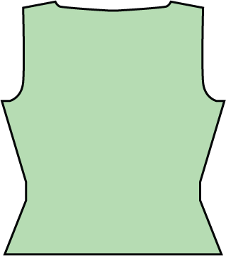
A rough schematic of what we are shooting for

Continue reading "Using Excel to aid in writing multi-sized patterns" »

August 3, 2007

Using Excel to create simple lace charts

Cross posted at the Create Along

People run pretty hot and cold, when it comes to the topic of charts. Personally, I'm a big fan of them, and when it comes to lace, I find it nearly impossible to work without a chart. If you saw my knitting notebooks, you'd see that, no matter how simple or complex, I always chart my lace patterns out. If you enjoy working from charts or if you ever need to create a chart for a pattern, you can produce good clean results with spreadsheet software like Excel. I've created several tutorials in the past, which you can access here. This tutorial will use some of the same techniques I've covered in Using Excel to design colorwork and Using Excel to aid in writing multi-sized patterns. If you haven't seen those tutorials and you aren't comfortable using a program like Excel, I suggest you browse them to get the basic concepts of working in Excel.

The lace

I've chosen a very simple lace stitch pattern, designed by Dorothy Reade, which I'm using in Donna Druchunas' upcoming book.
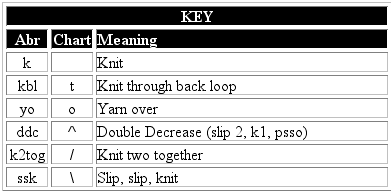
key.gif

Here are the verbose instructions.

Multiple of 6+7
Foundation row: k1, *kbl, yo, ddc, yo, kbl, k1* repeat to end of row
Even numbered rows: Purl
Row 1: ssk, *yo, kbl, k, kbl, yo, ddc* to last 6 stitches, then, yo, kbl, k, kbl, yo, k2tog
Rows 3, 5, and 7: ssk, *yo, k3, yo, ddc* to last 6 stitches, then, yo, k3, yo, k2tog
Row 9 and 13: k1 *kbl, yo, ddc, yo, kbl, k1* repeat to end of row
Row 11: ssk, *yo, kbl, k, kbl, yo, ddc* to last 6 stitches, then, yo, kbl, k, kbl, yo, k2tog

These instructions could be compressed even further, as the foundation row, 9, and 13 are all identical and 1 and 11 are identical. Even so, I find it hard to use these instructions to visualize what I'm doing. I also find that it takes me longer to memorize a lace pattern if I can't see it charted out.

Set up your workspace

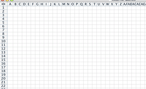
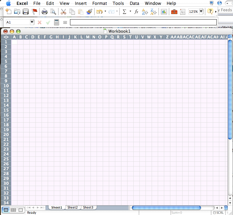
Select all the rows and cells in your Excel sheet and adjust the size of the cells to mimic the shape of a knit stitch. If need be, refer to the colorwork tutorial for more information on how to do this.

Based on the verbose instructions, I see that the +7 is made up of one stitch at the beginning of the row and 6 at the end and that there is a foundation row and 7 public side rows. Because I know this, I can number my rows and add grid lines.
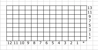
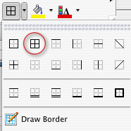
If you can't determine this from reading the instructions, just begin charting your lace, and go back add the row and stitch counts and your grid lines, later.

Inserting the first row of symbols

Foundation row: k1, *kbl, yo, ddc, yo, kbl, k1* repeat to end of row
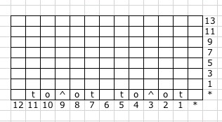
There is no need to download fancy schmancy knitting fonts. You can communicate with your standard set of characters. See the key above, to see how I've translated the stitches to letters. Use characters that will make sense to you. I like a blank stitch for knit, "t" for "twist," "o" for "yo," and slashes and a carrot for the decreases. Don't like that? Do something different. I won't hate.

The first row with a modified last repeat

Row 1: ssk, *yo, kbl, k, kbl, yo, ddc* to last 6 stitches, then, yo, kbl, k, kbl, yo, k2tog
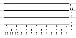
The first row in which we have a reason for those extra 6 stitches at the end. While the main pattern repeat requires a double decrease, the first and last decreases of the row will be single decreases. You will be able to see this more clearly when we get to the end.

Convert remaining rows to chart format
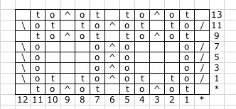
Complete the pattern as indicated in the verbose instructions. Whenever I can, I like to copy and paste, duplicate stitches and rows. Do whatever works best for you.

Double check your work, going stitch by stitch from text to chart.

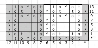
The end results are neat and clean, but would probably cause confusion. It's not clear where the pattern repeats begins and ends.

Outline the repeat

Select the stitches that make up the repeat. In some patterns, this is very intuitive based on how the pattern is written, but some patterns are harder to distill down to a repeat, especially those where the location of the repeat shifts for one area to another. Lucky for us, this pattern is expressly written to make the repeat obvious, it's everything between the two asterisks [*]
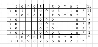
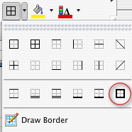
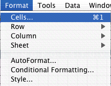
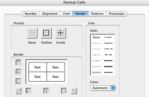
Just select the stitches you want to outline, and choose a thick border to outline it. You can choose a custom border by going to the FORMAT menu and choosing CELL.

Shading for clarity

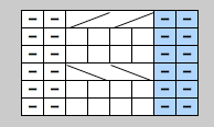
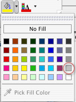
Finally, to make the repeat really obvious, shade everything that only gets worked once per row. This makes the repeat really clear and visually indicates the secondary elements.
I think that you'll find that many lace and knit/purl stitch patterns can be worked up this way. Have fun with it.

In the next tutorial, I'll cover doing more complex lace charts and discuss the ever-confounding "no stitch."

August 7, 2007

Using Excel for Complex Lace Charts

Cross posted at the Create Along

This tutorial is the 4th in my set of Excel tutorials. You can see the others here:

And, if you happen to have any tutorials of your own, please let me know.

In my last tutorial, I cover creating simple lace charts in Excel. Today, we'll approach a more complex lace pattern and introduce the no stitch. The lace pattern, I'll be covering, is most of the Peri's Parasol pattern I used in Chapeau Marnier.

What is a "no stitch"

More than any other single question, I get this most of all and I think it boils down to a lot of over thinking from the knitting community. Often, people ask if it means a stitch should be slipped. A no stitch, in fact, simply means there is no stitch in that spot. Some lace and cable patterns, change stitch count from row to row. The chart can be made a little more intuitive by distributing the stitches in a logical manner and spacing them with "no stitch" blocks. Generally, when using a "no stitch," one should format it in such a way that it can easily recede from focus. I usually shade mine in gray or black.

Format your spreadsheet

I begin, as always, by adjusting my cells so that they are approximately stitch like in proportion. See the tutorial on colorwork for more information about this step.


Select all the cells, go to the FORMAT menu and choose CELL


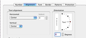
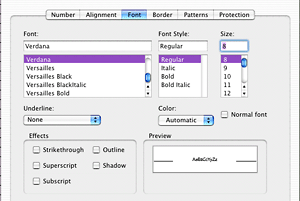
Set the alignment to be centered both horizontally and vertically. This will ensure your symbols are centered. Set your font size and add borders to all your cells.


Continue reading "Using Excel for Complex Lace Charts" »

February 13, 2008

Excel for Charting Simple Cables

While on Ravelry, the other day, the topic of charting cables came up and it occurred to me that I've covered using Excel for; colorwork, pattern writing, simple lace charts, and complex lace charts. But what's this? No cables? Have I been smokin' the wacky tobacky?

Now, cables can get pretty complicated, and there will be times when your design, just can't be visualized with the tools built into a spreadsheet program, but for pretty standard cables, I think I can cover what you need here.

As always, I start by formatting my page.

I've covered this in previous episodes, so browse those, if you aren't sure how to change the size of cells to be more knit stitch shaped.


Our first cable is going to look like this.

This chart would read, if written out:

  • Row 1: P2, *k4, p2* repeat from * to * to end of row
  • Row 2: Knit the knits and purl the purls
  • Row 3: P2, *slip next 2 stitches on cable needle and hold in front, k2, k2 from cable needle, p2* repeat from * to * to end of row
  • Rows 4&5: Repeat row 2
  • Row 6: P2, *slip next 2 stitches on cable needle and hold in back, k2, k2 from cable needle, p2* repeat from * to * to end of row

So those diagonal lines simply represent the stitches being crossed. They may not look exactly like other charted cables, but they convey the intention and the approximate look of the cable.

Continue reading "Excel for Charting Simple Cables" »

May 1, 2008

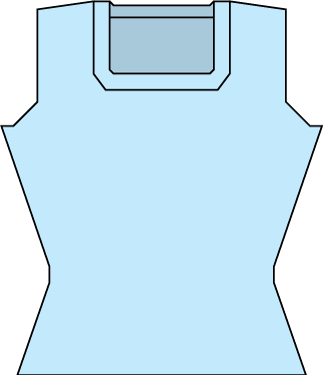
Creating Schematics in Illustrator

Most images can be clicked for a larger view.

I get a surprisingly large number of questions about schematics so I thought it was time to cover that topic here.

This tutorial is meant to give you some basic skills for creating schematics in Adobe Illustrator or a similar vector based application. There are countless ways to create schematics, this is just how I like to do it. Hopefully, even if you don't have Illustrator, some of my suggestions will be useful for you if you've struggled with making your own schematics. These instructions are written by a Mac user and I am using Illustrator CS2 and CS3. I will try to provide appropriate alternatives for PC in brackets [], but no promises that they will be 100% accurate. Refer to your Help menu, if need be, for PC or older versions of Illustrator.

The first step, of course, is to open a blank document. (Once you've made a few schematics you like, you can start using the ones you've made as a template, which will save oodles of time.) I like to build the schematic to the approximate scale of the sample I am or will be knitting.

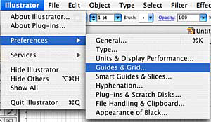
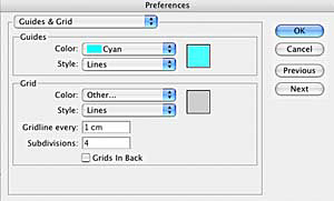
Once you have a blank document, go to the Illustrator Preferences [Options] and choose Guides and Grids.

You can use whatever you like for measurements, but I find it useful to start with a centimeter per inch relationship. I set up grid lines every centimeter with 4 subdivisions each, which allow me to get quarter inch increments in my scaled down schematic.

To make your grid visible, type CMND+' [CTRL+']


Continue reading "Creating Schematics in Illustrator" »

May 22, 2008

Excel for Pattern Writing - Part II

Most pictures may be clicked to enlarge.

Since the last tutorial on using Excel for pattern writing, I've refined a lot of how I manage my spreadsheets. I've been playing around with different formulas in Excel to find ways to make pattern writing easier. You know what that means, another tutorial.

Download the spreadsheet and play along at home. I'll be making references to various parts of the spreadsheet so go ahead and open this baby up.

NOTE: The attached spreadsheet is just a sample and contains measurements that may be useful but which may not meet the standards for some publications. You are welcome to use what I have for your own design purposes but it'll be you who has to ultimately support any patterns written from it, so do your research first.

Special notes:
I've used Ysolda's measurement chart as a reference for many of the basic sloper measurements.
I'm using Amy O'Neill Houck's tutorial on estimating yardage to create my yardage estimation formulas.

The goal

So, like last time, I'm just giving you instructions for a basic shell. All the same formulas can be used to build sleeves. Just use this as a starting point.


A rough schematic of what we are shooting for

Continue reading "Excel for Pattern Writing - Part II" »

May 29, 2008

Excel for Pattern Writing - Part III

Most pictures may be clicked to enlarge.

This tutorial picks up where the last tutorial left off and uses the formulas found in this spreadsheet. This tutorial can stand alone but may reference Excel skills covered more fully in previous Excel tutorials. If you haven't used the program much, you may want to review these other tutorials.

NOTE: The attached spreadsheet is just a sample and contains measurements that may be useful but which may not meet the standards for some publications. You are welcome to use what I have for your own design purposes but it'll be you who has to ultimately support any patterns written from it, so do your research first.

Special notes:
I've used Ysolda's measurement chart as a reference for many of the basic sloper measurements.
I'm using Amy O'Neill Houck's tutorial on estimating yardage to create my yardage estimation formulas.

The goal

In the last tutorial, we learned about

  • Rounding
    • Round to a whole number
    • Round to the nearest Even or Odd number or Round, Round Up or Round Down
    • Round to a multiple
    • Round to a multiple plus

In this tutorial, we'll cover

In the final tutorial, we'll cover

  • Calculating finished garment measurements
  • Calculating yardage based on a sample
  • Putting your numbers into MS Word

Continue reading "Excel for Pattern Writing - Part III" »

June 7, 2008

Excel for Pattern Writing - Part IV

Most pictures may be clicked to enlarge.

This is the last in a 3-part tutorial covering this spreadsheet, and one of several tutorials on using Excel for designing. There are two previous tutorials in this particular series that combined, give you all the info you need to understand the various fields in the spreadsheet. And that spreadsheet? It's got the raw numbers needed to make this little shell.

NOTE: The attached spreadsheet is just a sample and contains measurements that may be useful but which may not meet the standards for some publications. You are welcome to use what I have for your own design purposes but it'll be you who has to ultimately support any patterns written from it, so do your research first.

Special notes:
I've used Ysolda's measurement chart as a reference for many of the basic sloper measurements.
I'm using Amy O'Neill Houck's tutorial on estimating yardage to create my yardage estimation formulas.

The goal

In the two previous tutorials, we learned about

  • Rounding
    • Round to a whole number
    • Round to the nearest Even or Odd number or Round, Round Up or Round Down
    • Round to a multiple
    • Round to a multiple plus
  • Intro to IF statements
  • Evenly spacing shaping
    • Every X rows Y times
    • Next and every X rows Y times

In this tutorial, we'll cover

Continue reading "Excel for Pattern Writing - Part IV" »

November 26, 2008

Using Photoshop to color your sketches

Most images can be clicked to zoom.

Perhaps you need to submit sketches of a pattern for consideration in a publication, or maybe you are just designing for yourself and want to play with color combinations, regardless of your reasons, you don't need a full set of pencils and markers to colorize your drawings and if you use Photoshop, you change the colors over and over again, without having to do a new drawing. I'm going to cover some very simple techniques, that you can build upon to create your own style.

As with all my tutorials I want to make it clear that I'm not an expert, these are just some suggestions. I don't supply support for these methods and cannot offer instructions for older versions or open source alternatives to the program indicated. I am using Photoshop CS3 on a Mac, but will try to provide PC equivalents when I know them.

And, of course, if you have any suggestions, leave them in the comments. I love learning new tips.

Start your sketch

You may download my original, unretouched sketch here, and play along at home. The final document is available here.

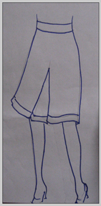
I generally do my sketches on paper. I'm not a fine artists, so I often use catalogs as reference for the way clothing drapes and the correct proportions for the human form. I don't like to actually trace images, because I think this looks too stiff. I prefer to just use the image as a visual reference and draw the images by hand. You should do what produces the best results for you.

In this case, I want to draw a skirt. I looked around online and found this cute number over at the Gap. I lightly drew my sketch with pencil then outlined only the most important features with a thick dark marker.

If you have a scanner, great, scan it. I have one but I generally just take a picture with my digital camera, like I have here. The lighting was atrocious that day, so the paper is pretty dark, but that's totally fine.

Now, open the image in Photoshop.

Continue reading "Using Photoshop to color your sketches" »

May 20, 2009

Creating Colorwork Charts in Illustrator

In a previous tutorial, I have covered making colorwork charts in Excel. Excel is a wonderful option for simple charts because most people have access to and a comfort level with it or to a similar opensource alternative. However, for the persnickety designer, Excel lacks a certain level of precision and flexibility. Illustrator has a steeper learning curve but gives you unlimited freedom in designing your charts and many more options for file formats.

For this tutorial, I'm experimenting with doing videos instead of my usual written out method. I would love your feedback on which you prefer. You'll have to excuse my crummy editing, I'm still finding my way around iMovie.

I'm embedding the tutorials below, but I think you'll find them easier to view in High Quality [HQ] and in full screen, so you may want to watch the videos over in YouTube by clicking these links: Part I, Part II, Part III. If there's a good response to these video tutorials, I'll continue to create them, otherwise, I can go back to my old method.

As always, my standard caveats:

  • There are oodles of ways to create charts. This is one way, not necessarily the right or best way. Play around with the tools you have and adjust as you see fit.
  • I work on a mac and am using Adobe Illustrator CS3. Other versions of Illustrator, on other platforms may work differently. Consult your users manual if needed
  • I love hearing your ideas. If you have suggestions, leave them in the comments.

Download the Illustrator file here. Note: I've converted this file to be compatible with Illustrator 10 and higher.


January 12, 2010

Creating Standard Stitch Pattern Charts in Illustrator

It's been a long time, but I've finally added another installment to my Illustrator for Charts series.

Standard caveats: This tutorial is shown on a Mac using Adobe Illustrator CS3. If you are on a different platform or a different version of Illustrator, some steps may be different. I do not offer Illustrator support. If you have any questions beyond what is shown in this tutorial, you will need to refer to your user guide. But, if you have any tips, suggestions, or corrections, feel free to leave them in the comments.

For those who haven't had a chance to view them, there are three very detailed introductory tutorials for colorwork charts. These will give you a strong foundation for building charts in Illustrator and the skills learned there will be applied to this and any subsequent tutorials I do. You can view Parts 1, 2, and 3 if you haven't already.

This next tutorial expands on those skills to create your standard, non-cable stitch patterns charts, including knit and purl, and lace patterns. We'll learn how to make some commonly used stitch symbols using shapes, and the pen tool.

If you would like to download the file I created in the tutorial, I have saved it to be compatible with versions of Illustrator as old as version 10. Download it here. You are welcome to use this file for any commercial or non-commercial purpose.

At some point, I want to conclude this series with a tutorial on cable charts. They are not hard but have a few additional considerations we haven't had in these previous tutorials. If you have any other requests, don't hesitate to let me know, in the comments.

February 2, 2010

Illustrator for Cablework Charts

My final installment of the Illustrator for knitting charts series, is now completed. I think that those of you who feel comfortable with the first two tutorials will find this one pretty straightforward, with just a couple new skills to apply.

For those of you who haven't seen the other tutorials, I highly recommend you watch them before trying this tutorial.

Illustrator for colorwork charts, has all sorts of introductory information on using Illustrator which will be applied through all the subsequent tutorials.
Part 1
Part 2
Part 3

Illustrator for stitch pattern charts, builds off those basic skills and adds custom made shapes.
Watch it here.

Lastly, here is Illustrator for cablework charts where we expand on making custom shapes and build a more complex chart. I've created this last tutorial in High Def so you can enlarge these and really get a good look at what I'm doing.

Part I

Part II

Download the chart I built here and play along at home.

Next up, I'd like to do a tutorial or two on InDesign and features that may be useful to designers. If you have any questions or requests, please don't hesitate to leave me a comment. And of course, any hints or tips you want to share would be great.

July 22, 2010

Creating Schematics in Microsoft Word

A couple years ago, I did a tutorial for creating schematics in Illustrator, which is my preferred method. But I realize Adobe products are expensive and not necessarily easy to learn, while almost everyone has Microsoft Office, or a less expensive or free alternative. This tutorial will walk you through creating simple schematics in Microsoft Word. You may also download the file I created so you can play around with it and use it as a jumping off point for your own schematics. Links at the end of this post.

This tutorial is a two part video tutorial. I strongly recommend you enlarge these to full screen and watch them in high definition, if your computer will allow it.

There are usually a dozen different ways to get the same or better results so play around with the program and feel free to experiment. If you have any tips, tricks, suggestions or questions, leave them in the comments below, I love to hear what you think.

Download a copy of the sample file for MS Office 2008 here
Download a copy of the sample file for older versions of Office here

Check out all my design related tutorials here.

January 17, 2011

PDF Patterns: Files Formats and Sizes

Today's post is going to be a little technical but I hope it will help people choose the best file formats for their graphics, charts and other visual elements in their patterns. As always, this is based on my own experience and the software that I have available to me, on the operating system that I use. Don't be afraid to question any of this and run your own tests. If you are printing your patterns through a professional printer, be sure to ask them what settings and file formats they recommend.

A little background. Skip this if you are in a rush.

In the mid 90s I was working at the Boston Globe in the Advertising Production department and, despite the fact that newspapers may be one of the slowest industries to embrace new technology (ask me about Atex sometime) we had begun to accept PDFs from customers sending in their ads. In the time after x-acto knives and real dark rooms, but before the invention and wide acceptance of PDF technology, departments, like the one in which I worked, kept Macs and PCs running PageMaker, Quark, Illustrator, Freehand and often a few more obscure layout programs, in various versions to accomodate the vast variety of files that might come in from customers. Even if we had the software to open someone's file, we still had to contend with the fonts. Oh the fonts. PC fonts wouldn't run on Macs and vice versa (still the case for most older fonts, but OpenType fonts are now cross-platform), the fonts from Company A might conflict with the version from Company B, already running on that machine, and all of this was before the ad ever hit the RIPs. These were the hurdles we faced in ensuring that the advertiser's ad looked the same when it left their computer as it did when it printed out on that dingy newsprint, a few days later. Even if the advertiser had the forethought to send an EPS file, there was still a strong likelihood that some percentage of the files would have font problems, and worse, once in EPS format, there was little we could do to resuscitate the ad if there were a problem.

I realize to the younger amongst you, that all this sounds a bit old fashioned and silly. One might wonder if I also had to walk six miles, uphill, both ways, in the driving snow, in my bare feet, just to get to work. To you I say, "pull up your pants, get a haircut and get off my lawn."

But in all seriousness, the PDF file format was a huge boon to publishers like newspapers. Finally, an entire ad, built in any program, on any operating system, using any fonts, could be delivered to a printer anywhere and the printed file would look just like it did back at its birthplace. Even the company using Ventura Publisher and their own custom made fonts, was able to get great results from anyone printing their files.

Knit and crochet designers have benefited from this technology too. Not only can we provide customers with a file format that can be opened on just about any computer using, a free application, but we can be sure that the text will look and flow the same way wherever the pattern is viewed or printed. I don't think it's hyperbole to state that, second to the internet itself, the PDF file format is one of the primary reasons it is so easy for independent designers to self publish.

Continue reading "PDF Patterns: Files Formats and Sizes" »

May 24, 2012

Signing Digital Contracts: Creating a Signature

As a freelance designer, I sign a lot of contracts. It's just part of working with businesses on a project by project basis, and about 99% of the time, those contracts come to me as digital files.

I have a fax machine at home, and I could print out my contract, sign it, fax it to the person who needs it, who probably gets their faxes printed out on more paper and then I could wait to get a copy of the version they signed, and file that away, but honestly, that seems wasteful and unnecessarily labor intensive. I'm also partial to storing files digitally so the paper workflow is not ideal. I have enough unsorted clutter in my house.

As a side note, while I'm posting this as a knitwear design tutorial, it really is just a useful thing to know in general. This skill was invaluable when we were buying a house, and again when we refinanced. If you are applying for jobs, filling out contracts, or signing any file you receive digitally, you can use the methods I'll be covering.

In this post, we'll be covering the creation of a reusable image of your signature. Because I'm not completely out of my gourd, I am going to be using a signature of my nom de rien, Lady Awesome Pants, as opposed to my actual real signature, which someone might want to use for nefarious reasons.

In the following posts, we'll discussing using the image to sign your contract.

If you want to play along with the home game, you can download the signature, a sample Microsoft Word contract and a sample PDF contract by clicking the links. You can also download the unretouched scan of the signatures, here.

For this step, you'll need:

  • pen
  • paper
  • scanner or digital camera
  • Adobe Photoshop or photo editing software of choice*

*I'm using Adobe Photoshop CS5 on a Mac. If you are using a different photo editing software, you may need to refer to your user's manual.

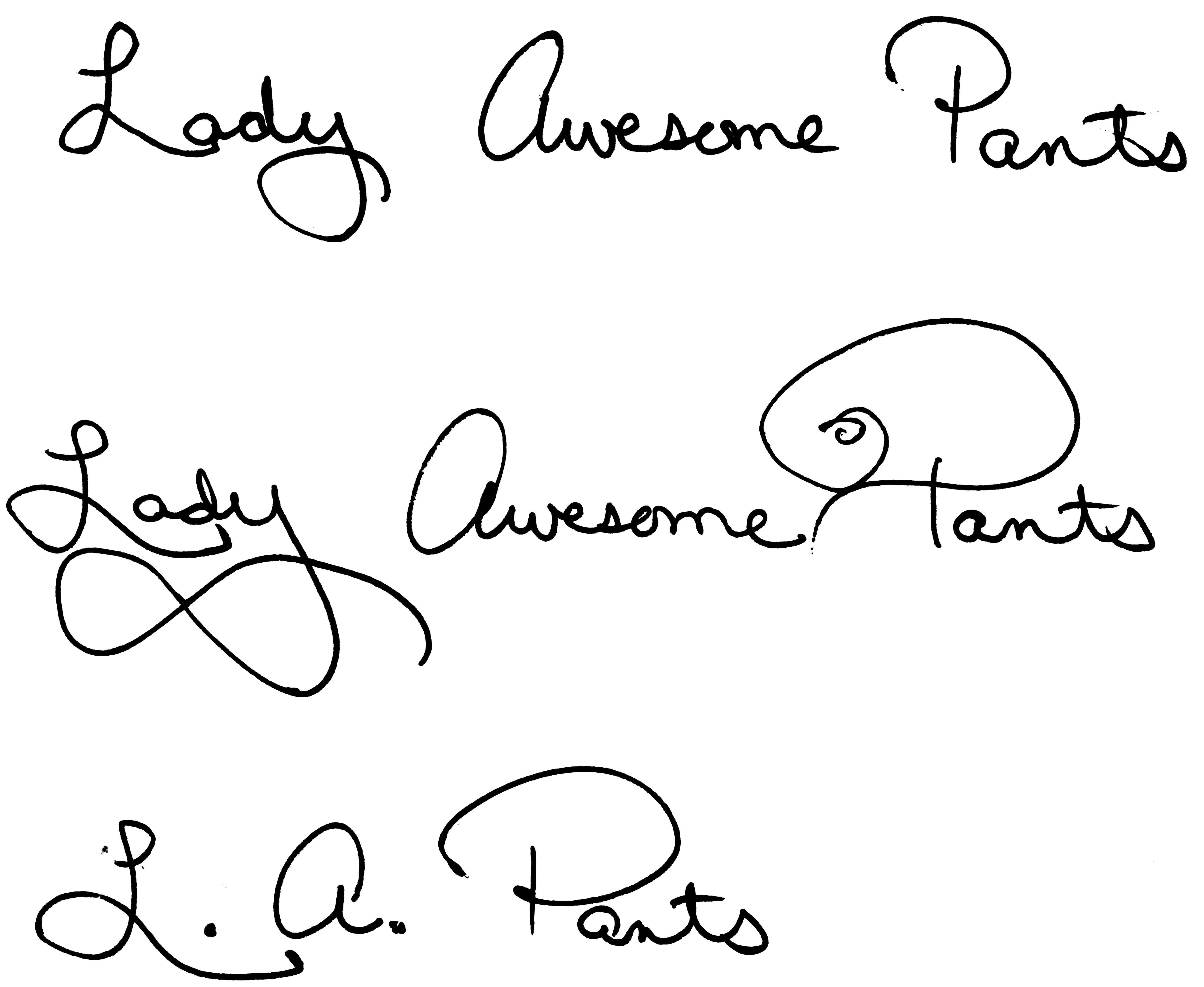
Find yourself a good, medium point, dark (preferably black) ink pen and a clean piece of paper (no lines, no show-through from anything printed on the other side) and write your name and/or initials a bunch of times. Try to do this on a surface that's not too hard, a catalogue under your piece of paper works nicely. Press firmly as you sign. You don't want a light whispy signature, you want something clear and legible.

signature samples
Signature Samples

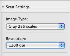
Once you know you have at least a few examples that you like, get ready to scan your page. I usually scan the whole page. Sometimes, it's not until after you've cleaned up the scan, that you can tell which signature will work best. I like to scan at a high resolution, in grayscale, to ensure I get all the detail I need with no unnecessary noise.


Scanning settings

If you don't have a scanner, you can photograph your signatures with a digital camera, just make sure you do so in good, natural light, on a background that won't show through your paper and that the signatures are in focus.

Depending on your scanner, your digital camera, the lighting, and whether or not you fed your Mogwai after midnight, your digital file may be too dark or too light or otherwise somewhere short of perfection.

Note: If you scanned or photographed your signature in color, convert your file to Grayscale by going to IMAGE | MODE | GRAYSCALE before proceeding.

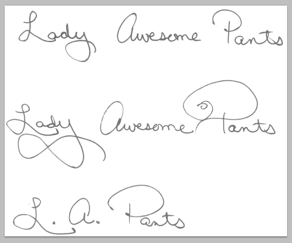
Scan
This raw scan is not living up to its full potential

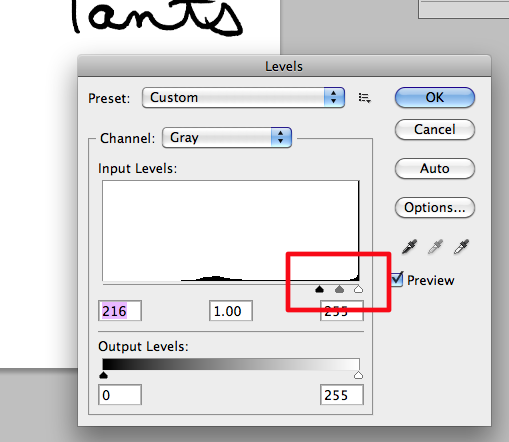
In Photoshop, go to IMAGE | ADJUST | LEVELS

This will bring up a set of sliders that will allow you to clean up your scan. Bring the black triangle as close to the white triangle as possible. That will make everything on the page either pure white or pure black and remove all shades of gray. Play around with moving them more to the left and more to the right. One direction will make your lines appear thicker, the other will make them thinner.

adjust levels
Adjust Levels

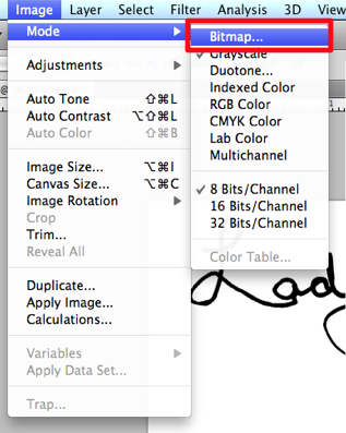
Next we'll convert the mode to Bitmap. Your image must already be grayscale for this option to be available. If it's not grayscale, convert it now. Bitmap files are made up of only black and white pixels, no shades of gray, no color. This is a good format for pixel based logos and line art. Additionally, many programs, like InDesign, Quark and other desktop publishing applications, will view the white pixels in bitmap images as transparent, which can be useful with signatures that are supposed to sit on a line. You'll see how this works in the InDesign portion of this tutorial, to come at a later date.

Go to IMAGE | MODE | BITMAP


Convert image to Bitmap
Change Mode to Bitmap

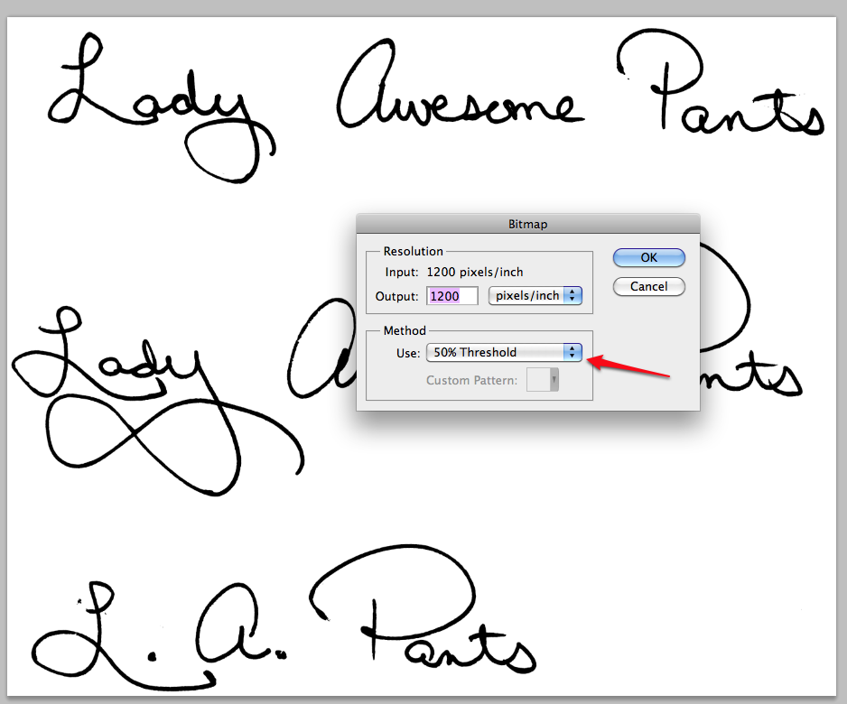
Choose 50% Threshold from the Method drop-down. I like a resolution of about 1200 dpi. I would avoid going below 1000 dpi.

bitmap settings
Settings for conversion to Bitmap

If you adjusted your Levels properly, you won't notice much change in your file. If your signature looks too washed out or too blobby (technical term) after conversation, that means you didn't adjust your Levels slider to be close enough together. Simply undo and adjust your Levels further.

If you are happy with the results, you can crop your image so that you only have your favorite signature visible.

cropped signature
Cropped

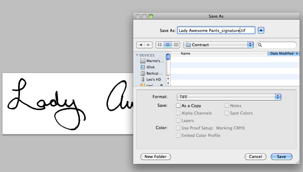
Save your file as a TIFF.

Save as tiff

You might be thinking, "But Marnie, what is this TIFF madness of which you speak? Why can't I save it as a JPEG?"

JPEGs do not support the BITMAP format because JPEGs are always, RGB (color) images. So all that work converting to a bitmap, to make a good quality piece of line art, will be lost. It will still work well enough, but if your image software supports Bitmap and TIFF format, that's the way to go.

That's all there is to it. You now have a lovely file of your own signature, that you can use to sign digital files.

In the next tutorial, we'll talk about using the file to sign Microsoft Word documents and in the third and final installment, we'll use this file in InDesign and talk about adding typed text to PDF forms.

May 25, 2012

Signing Digital Contracts: Adding your signature to a MS Word File

This is part two of a three part series on adding your signature to digital files. In the first part, we discussed making a TIFF of your signature. In this part, we'll discuss adding your signature to a contract, if it's sent to you as an editable Microsoft Word file.

If you want to play along with the home game, you can download the signature, a sample Microsoft Word contract and a sample PDF contract by clicking the links.

For this step, you'll need:

*I'm using Microsoft Office 2008 on a Mac. This should work in programs like Open Office, Pages, or other word processing programs, but the individual steps my vary. You can refer to your help menu or user manual for more guidance.

Before we get started, let me just say that word processors are called, "word processors" because they are meant to, um, process words. I know, obvious. But the point is that word processors are not layout design tools. They support including images and spreadsheets and flow charts and various and sundry other bells and whistles, but just as you'd want to track your businesses expenses in Excel, not Word, you need to accept that Word manages layout design duty the way Carrot Top manages his face (it ain't pretty.) All this is to say that while Word does an acceptable job of allow you to plop your signature into a document, it's not an ideal solution. Personally, if it's an option, I'd rather save the document as a PDF and use the method I'll be outlining in the third and final portion of this tutorial. But it's good to know these skills, regardless, so I'm covering them here.

Begin by opening your contract in Microsoft Word.

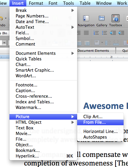
Place your cursor where you'd like to place your signature and go to INSERT | PICTURE | FROM FILE

import image
Insert picture

Navigate to your signature and double click it.

Note: If the image is grayed out, it means the signature is a file format your word processor doesn't support. Word is pretty accommodating, open source alternatives may be more restrictive. If your image file format is not supported in your word processing program, open your signature in your photo editing software and save it as another file format. JPEG should work fine for this purpose.

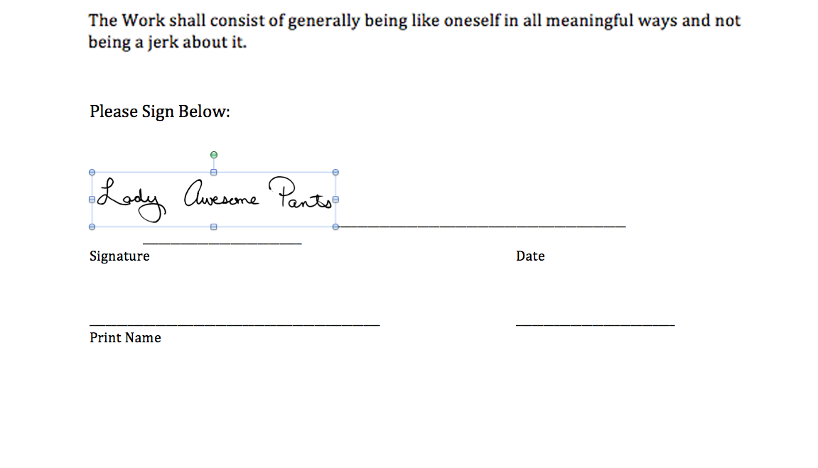
Your image will now appear somewhere near where your cursor was. It has probably caused portions of the page to reflow, move or shift in some aesthetically unpleasing way. Depending on how the page is formatted, it may look acceptable or it may look more like the example below.

signature on the paeg
Image imported

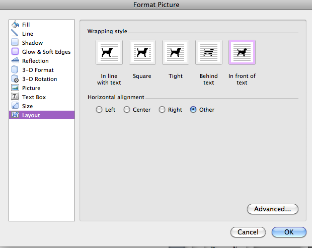
Double click the signature to pull up the Format Picture dialog box. Your dialog box may look different than the image below. Look along the left side and choose the LAYOUT option from the list.

format picture - layout
Format Picture Layout options

From the Wrap Style icons, choose IN FRONT OF TEXT. When you make edits, in the dialog box, you'll see changes happening on the page. Do not be alarmed if your picture jumps around even if it's not in you view at that moment. Click OK to continue.

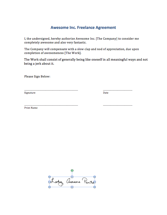
Find your signature on the page. Mine jumped down to the bottom. Remember what I said about Word being a not-good tool for layout? This is a good example. Why changing the wrap should send the image hurtling to the bottom of the page is beyond me, but there it is.

free range signature
Signature on the loose

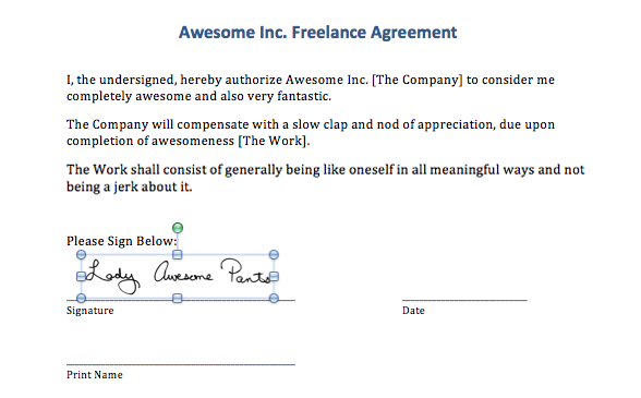
Move your cursor over the signature, click it and drag it into position. In Word, I place it just above the signature line so that it doesn't overlap. You can drag the corner of the signature, holding down your SHIFT key so it doesn't distort, to adjust its size on the page.

moved and resized
Signature in the right place, at the right size

Depending on how your contract is formatted, the underlines may be created by applying an underline style, adding an underline to a tab stop or by typing an underscore repeatedly. I find the last used most often so that's what's in our sample contract, but in any of those cases, you'll probably need to include the date and your name somewhere. Unless someone has made an interactive form, there's really no pretty way to handle this short of reformatting someone else's file so I usually just settle for the"good enough" solution that follows.

Select enough underscore characters to accommodate the date. If you are using a MM/DD/YY type format, you won't need to select many characters. If you are using the FULLMONTH DAY, YEAR format, you may need to select the whole line.

select the line where the date goes
Selected underscores

Type in the date. If you removed too many underscores, you can simply type additional ones in. If you didn't select enough underscores and some have jumped to the next line, just delete them.

Repeat this process for your name.

do the same for your name
Add your name

And that's it!

You can email your contract back as is, or save it as a PDF if you prefer. Personally, I'd rather send a PDF which can be locked so that the signature file cannot be reused. It's not a foolproof plan but handing a high quality picture of your signature off to someone you barely know, just seems a little unwise.

May 26, 2012

Signing Digital Contracts: Adding your signature to a PDF in InDesign

This is part three of a three part series on adding your signature to digital files. In the first part, we discussed making a TIFF of your signature, in the second part, we added that signature to Microsoft Word. In this part, we'll use InDesign to add our signature to a PDF. We'll also learn about filling out forms in InDesign.

If you want to play along with the home game, you can download the signature, a sample Microsoft Word contract and a sample PDF contract by clicking the links.

For this step, you'll need:

  • the digital version of your signature that we made in the first tutorial
  • sample PDF contract
  • InDesign*
  • A rudimentary understanding of InDesign and it's most basic selection and text tools

*I'm using InDesign CS5 on a Mac. This should work in other desktop publishing programs, including Scribus, a free open source alternative, but the individual steps my vary. You can refer to your help menu or user manual for more guidance.

For the sake of simplicity, I'm going to opt for the least technical explanations, I can. Most steps have a keyboard shortcut equivelent, but I'll tell you where the option is in the menus, and I will describe tools by how they appear, not necessarily by their technical name.

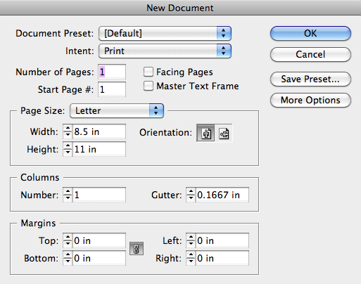
Open InDesign and create a new document. You will want to have the same number of pages as there are in your contract. Set your margins to 0 and make sure your pages are the same size as your contract. Contracts from Europe will likely be on A4 sized pages. Contracts from North America will likely be on Letter sized pages. That's pretty much the extent of my default paper size knowledge. Since you don't need to print anything out, it doesn't matter, your digital file can support either or both sizes, if you like.

New document dialog box


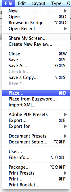
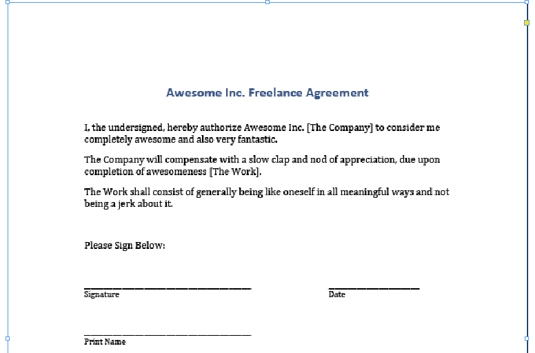
The next step is to place your PDF. Go to FILE | PLACE and navigate to the PDF of your contract.

place
File | Place


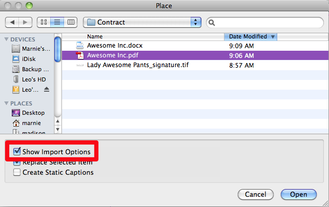
IMPORTANT: click the SHOW IMPORT OPTIONS check box before proceeding.

Show import options
Show Import Options


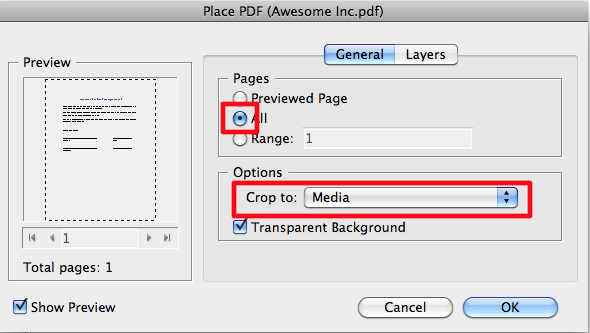
This will bring up a set of import settings. Choose to import ALL the pages and set the "Crop to" drop-down to "Media".

import settings
Import settings


Your cursor will change, giving you a tiny thumbnail of the first page of the contract. Click in the upper left corner of your page to place the first page of the contract. If you have multiple pages to your contract, the next page will now be loaded into your cursor and you can place it on the next page of your InDesign document. Continue this process until all pages have been added.

place contract pages
Contract is now placed in InDesign


Note: The default setting in InDesign is to show a low resolution preview of the PDF in InDesign. This is not reflective of the actual quality of the file. The quality is determined by the original PDF and whatever export settings you use when you make the signed version of the PDF.


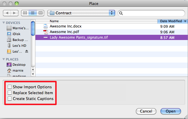
Navigate to the point in the document where your signature should appear. Go to FILE | PLACE, as we did above.

Select your signature file but turn off all the check boxes that were turned on before. We do not want import options and we do not want the signature to replace any selected images.

select signature file
Find your signature and turn off import options


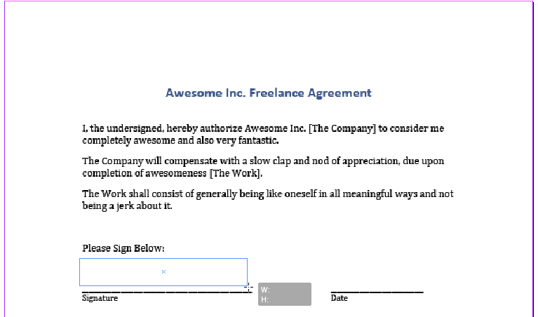
Your cursor will now be loaded with the new image. If you just click, anywhere on the page, the image will appear, or you can click and drag a box that matches the size you want your image to be. Either method will work but the latter will save you the step of having to resize your signature.

place signature
Place your signature


With the black arrow tool selected from your toolbar click the signature.

select signature
Select signature


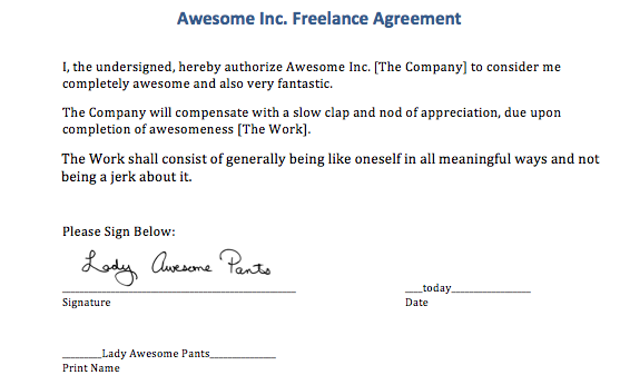
And drag it into place or nudge it with the arrow keys on your keyboard. Even though the black signature is on a white background, if you created a bitmap TIFF file, InDesign will treat any white pixels as transparent, so your descenders can dip below the signature line.

signature in place
The signature in its place


That's pretty much it for adding an image. If that's all you need to do, you can skip ahead to the end, where we make a PDF to send.

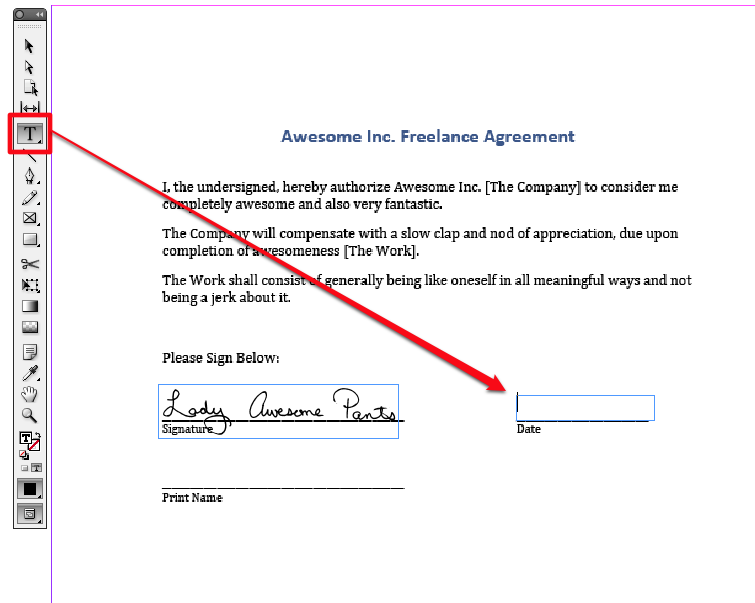
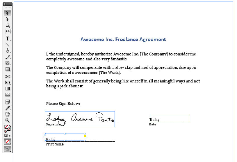
If you have text to add to the page, you'll need to select your standard text tool from the toolbar. Use this to draw a box over first space requiring text.

create a box for the date
Use the text tool to create a text frame


Type in the relevant text. If, after typing in the text, the frame is blank or the text cut off and you see a little red plus sign, that means your frame is too small to hold the text. Use your black arrow to resize the frame.

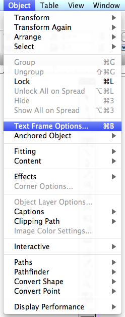
With your text frame still selected, go to OBJECT | TEXT FRAME OPTIONS to modify your text frame.

Text frame options
Modify the options for your text frame


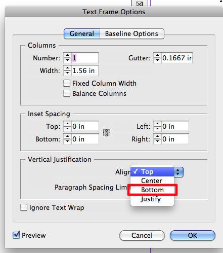
The default vertical alignment is TOP. From the drop-down, choose BOTTOM. This step is totally optional but it makes it easier to align items to a visual baseline.

Change the vertical alignment
Set vertical alignment


If you were about to fill out a bajillionty page contract or job application, and you wanted to save yourself a few moments, you could use this opportunity to define the current text frame settings as your default text frame settings. That's a bit out of the scope of this tutorial, but the options for defining object styles are in the Object Styles Palette, which look a little like this.

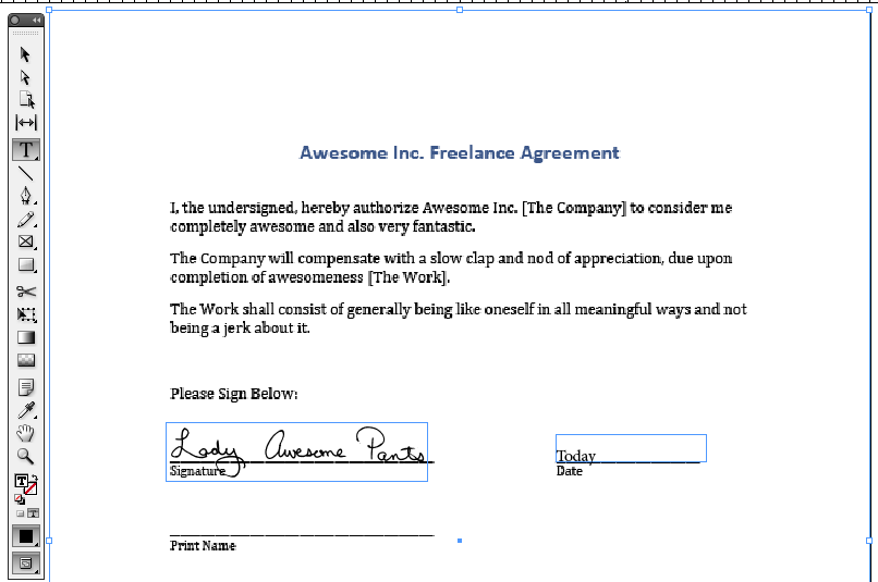
The vertical alignment change will push your text to the bottom of the text frame. It will look something like this.

vertical align bottom
The date is aligned to the bottom of the text box


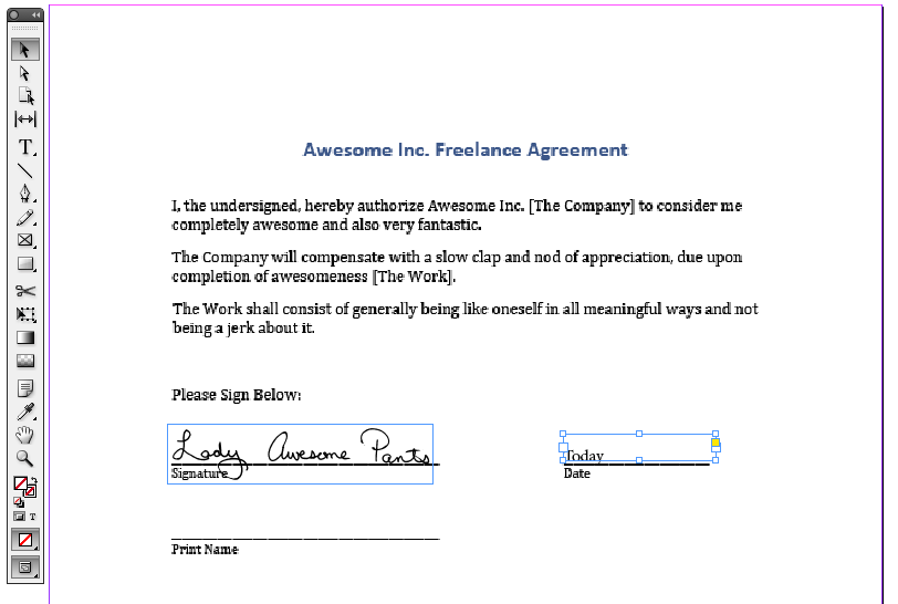
You can nudge the text frame so that it is as far above of the line as you find visually acceptable.

nudge text frame
Nudge text frame into place


To quickly create a second text frame with the same attributes, hold down Option (Mac) or Alt (PC) button and click and drag on the text frame. This will create a copy of the text frame, leaving the original one where it was. Drag or nudge it into its final position.

Option/Alt drag the text frame to make a copy.
Create a second text box


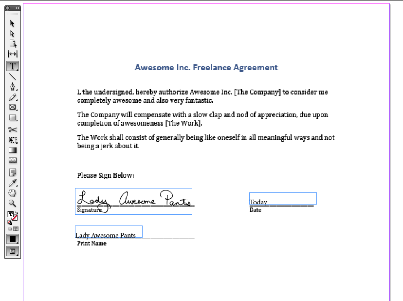
Double click on the frame to edit the text or switch to your text tool, and then modify the text.

change the text
Update the new text box


Continue in this manner until you've filled out all the applicable information and signed in all the indicated spots.

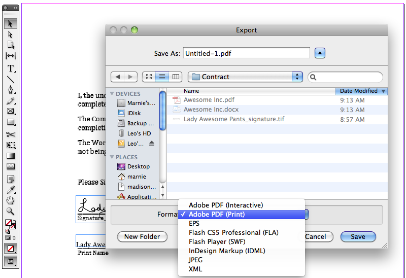
The only step remaining is to create a PDF. Go to FILE | EXPORT. A dialog box will appear. Choose Adobe PDF (Print) from the Format drop-down list.

Choose PDF
Choose PDF from the drop-down


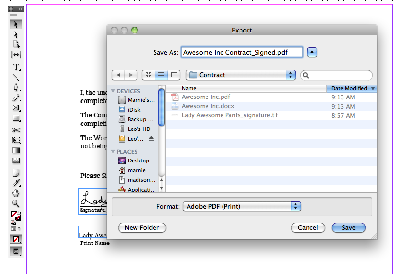
Name your PDF and click Save to complete the process.

give your pdf a name
Save your PDF


That's it! Your contract is ready to email back and you have a signed digital copy for your records.

I may actually add a part 4 to this 3 part series. Microsoft Word does allow the placement of PDFs and you could do a hybrid of the two methods to sign a PDF in MS Word. This would work well for people who do not wish to invest in buying and/or learning a desktop publishing application.

February 22, 2007

Tutorial - Using Excel to design colorwork

This entry has also been posted at the Create Along

Today, my intrepid reader, I hope to offer you some tips on using Microsoft Excel for designing colorwork. This will be a long and picture heavy post, so I hope you'll bear with me. Later, I will do a tutorial on designing stitch pattern charts in Excel. I am currently using Excel X for the Mac. I will do my best to provide instructions that can be used cross-platform and with older versions of the software, but your results may still vary. I've enlarged the cursors throughout, to make the actions more obvious and most of the images can be enlarged by clicking on them. Still, if you hit a snag, just drop me a comment or email and I'll try to help you out.

Many moons ago I bought a cute fair isle sweater. It was inexpensive but very cute, fit well was exceedingly warm. Unfortunately, she found her way into the wash and was never the same.

Sweater I bought and subsequently sent through the wash

Having escaped the drier, the sweater still fits but the fair isle portion pulls in and causes a weird a-line shape to the piece that is no longer flattering. I've been thinking I would like to reknit it, someday, using the same pattern, but perhaps some different colors. Excel can be a fun way to play with this idea.

Continue reading "Tutorial - Using Excel to design colorwork" »

June 28, 2007

Using Excel to aid in writing multi-sized patterns

This entry also posted at the Create Along.

Download the spreadsheet and play along at home.

It's been a while since I've done a tutorial and seeing as I use this technique all the time, it's about time I shared it with all of you. This also makes me feel better about the fact that I do not have any updates on my CAL project to post, as my deadline pieces are all keeping me busy.

NOTE: The attached spreadsheet is just a sample and contains measurements that may be useful but which may not meet the standards for some publications. You are welcome to use what I have for your own design purposes but it'll be you who has to ultimately support any patterns written from it, so do your research first.

The goal

Excel can be used to help you organize and plot your final pattern. Unfortunately, it can't do all the dirty work, but you can find yourself being a bit more consistent, if you let the program do your calculating. If you plan to submit your patterns for publication, providing a spreadsheet with all your work can be of great help to the tech editor. Doing so, may make logic errors more obvious and allow for faster editing.


A rough schematic of what we are shooting for

Continue reading "Using Excel to aid in writing multi-sized patterns" »

August 3, 2007

Using Excel to create simple lace charts

Cross posted at the Create Along

People run pretty hot and cold, when it comes to the topic of charts. Personally, I'm a big fan of them, and when it comes to lace, I find it nearly impossible to work without a chart. If you saw my knitting notebooks, you'd see that, no matter how simple or complex, I always chart my lace patterns out. If you enjoy working from charts or if you ever need to create a chart for a pattern, you can produce good clean results with spreadsheet software like Excel. I've created several tutorials in the past, which you can access here. This tutorial will use some of the same techniques I've covered in Using Excel to design colorwork and Using Excel to aid in writing multi-sized patterns. If you haven't seen those tutorials and you aren't comfortable using a program like Excel, I suggest you browse them to get the basic concepts of working in Excel.

The lace

I've chosen a very simple lace stitch pattern, designed by Dorothy Reade, which I'm using in Donna Druchunas' upcoming book.

key.gif

Here are the verbose instructions.

Multiple of 6+7
Foundation row: k1, *kbl, yo, ddc, yo, kbl, k1* repeat to end of row
Even numbered rows: Purl
Row 1: ssk, *yo, kbl, k, kbl, yo, ddc* to last 6 stitches, then, yo, kbl, k, kbl, yo, k2tog
Rows 3, 5, and 7: ssk, *yo, k3, yo, ddc* to last 6 stitches, then, yo, k3, yo, k2tog
Row 9 and 13: k1 *kbl, yo, ddc, yo, kbl, k1* repeat to end of row
Row 11: ssk, *yo, kbl, k, kbl, yo, ddc* to last 6 stitches, then, yo, kbl, k, kbl, yo, k2tog

These instructions could be compressed even further, as the foundation row, 9, and 13 are all identical and 1 and 11 are identical. Even so, I find it hard to use these instructions to visualize what I'm doing. I also find that it takes me longer to memorize a lace pattern if I can't see it charted out.

Set up your workspace

Select all the rows and cells in your Excel sheet and adjust the size of the cells to mimic the shape of a knit stitch. If need be, refer to the colorwork tutorial for more information on how to do this.

Based on the verbose instructions, I see that the +7 is made up of one stitch at the beginning of the row and 6 at the end and that there is a foundation row and 7 public side rows. Because I know this, I can number my rows and add grid lines.

If you can't determine this from reading the instructions, just begin charting your lace, and go back add the row and stitch counts and your grid lines, later.

Inserting the first row of symbols

Foundation row: k1, *kbl, yo, ddc, yo, kbl, k1* repeat to end of row

There is no need to download fancy schmancy knitting fonts. You can communicate with your standard set of characters. See the key above, to see how I've translated the stitches to letters. Use characters that will make sense to you. I like a blank stitch for knit, "t" for "twist," "o" for "yo," and slashes and a carrot for the decreases. Don't like that? Do something different. I won't hate.

The first row with a modified last repeat

Row 1: ssk, *yo, kbl, k, kbl, yo, ddc* to last 6 stitches, then, yo, kbl, k, kbl, yo, k2tog

The first row in which we have a reason for those extra 6 stitches at the end. While the main pattern repeat requires a double decrease, the first and last decreases of the row will be single decreases. You will be able to see this more clearly when we get to the end.

Convert remaining rows to chart format

Complete the pattern as indicated in the verbose instructions. Whenever I can, I like to copy and paste, duplicate stitches and rows. Do whatever works best for you.

Double check your work, going stitch by stitch from text to chart.

The end results are neat and clean, but would probably cause confusion. It's not clear where the pattern repeats begins and ends.

Outline the repeat

Select the stitches that make up the repeat. In some patterns, this is very intuitive based on how the pattern is written, but some patterns are harder to distill down to a repeat, especially those where the location of the repeat shifts for one area to another. Lucky for us, this pattern is expressly written to make the repeat obvious, it's everything between the two asterisks [*]

Just select the stitches you want to outline, and choose a thick border to outline it. You can choose a custom border by going to the FORMAT menu and choosing CELL.

Shading for clarity

Finally, to make the repeat really obvious, shade everything that only gets worked once per row. This makes the repeat really clear and visually indicates the secondary elements.

I think that you'll find that many lace and knit/purl stitch patterns can be worked up this way. Have fun with it.

In the next tutorial, I'll cover doing more complex lace charts and discuss the ever-confounding "no stitch."

August 7, 2007

Using Excel for Complex Lace Charts

Cross posted at the Create Along

This tutorial is the 4th in my set of Excel tutorials. You can see the others here:

And, if you happen to have any tutorials of your own, please let me know.

In my last tutorial, I cover creating simple lace charts in Excel. Today, we'll approach a more complex lace pattern and introduce the no stitch. The lace pattern, I'll be covering, is most of the Peri's Parasol pattern I used in Chapeau Marnier.

What is a "no stitch"

More than any other single question, I get this most of all and I think it boils down to a lot of over thinking from the knitting community. Often, people ask if it means a stitch should be slipped. A no stitch, in fact, simply means there is no stitch in that spot. Some lace and cable patterns, change stitch count from row to row. The chart can be made a little more intuitive by distributing the stitches in a logical manner and spacing them with "no stitch" blocks. Generally, when using a "no stitch," one should format it in such a way that it can easily recede from focus. I usually shade mine in gray or black.

Format your spreadsheet

I begin, as always, by adjusting my cells so that they are approximately stitch like in proportion. See the tutorial on colorwork for more information about this step.


Select all the cells, go to the FORMAT menu and choose CELL


Set the alignment to be centered both horizontally and vertically. This will ensure your symbols are centered. Set your font size and add borders to all your cells.


Continue reading "Using Excel for Complex Lace Charts" »

February 13, 2008

Excel for Charting Simple Cables

While on Ravelry, the other day, the topic of charting cables came up and it occurred to me that I've covered using Excel for; colorwork, pattern writing, simple lace charts, and complex lace charts. But what's this? No cables? Have I been smokin' the wacky tobacky?

Now, cables can get pretty complicated, and there will be times when your design, just can't be visualized with the tools built into a spreadsheet program, but for pretty standard cables, I think I can cover what you need here.

As always, I start by formatting my page.

I've covered this in previous episodes, so browse those, if you aren't sure how to change the size of cells to be more knit stitch shaped.


Our first cable is going to look like this.

This chart would read, if written out:

  • Row 1: P2, *k4, p2* repeat from * to * to end of row
  • Row 2: Knit the knits and purl the purls
  • Row 3: P2, *slip next 2 stitches on cable needle and hold in front, k2, k2 from cable needle, p2* repeat from * to * to end of row
  • Rows 4&5: Repeat row 2
  • Row 6: P2, *slip next 2 stitches on cable needle and hold in back, k2, k2 from cable needle, p2* repeat from * to * to end of row

So those diagonal lines simply represent the stitches being crossed. They may not look exactly like other charted cables, but they convey the intention and the approximate look of the cable.

Continue reading "Excel for Charting Simple Cables" »

May 1, 2008

Creating Schematics in Illustrator

Most images can be clicked for a larger view.

I get a surprisingly large number of questions about schematics so I thought it was time to cover that topic here.

This tutorial is meant to give you some basic skills for creating schematics in Adobe Illustrator or a similar vector based application. There are countless ways to create schematics, this is just how I like to do it. Hopefully, even if you don't have Illustrator, some of my suggestions will be useful for you if you've struggled with making your own schematics. These instructions are written by a Mac user and I am using Illustrator CS2 and CS3. I will try to provide appropriate alternatives for PC in brackets [], but no promises that they will be 100% accurate. Refer to your Help menu, if need be, for PC or older versions of Illustrator.

The first step, of course, is to open a blank document. (Once you've made a few schematics you like, you can start using the ones you've made as a template, which will save oodles of time.) I like to build the schematic to the approximate scale of the sample I am or will be knitting.

Once you have a blank document, go to the Illustrator Preferences [Options] and choose Guides and Grids.

You can use whatever you like for measurements, but I find it useful to start with a centimeter per inch relationship. I set up grid lines every centimeter with 4 subdivisions each, which allow me to get quarter inch increments in my scaled down schematic.

To make your grid visible, type CMND+' [CTRL+']


Continue reading "Creating Schematics in Illustrator" »

May 22, 2008

Excel for Pattern Writing - Part II

Most pictures may be clicked to enlarge.

Since the last tutorial on using Excel for pattern writing, I've refined a lot of how I manage my spreadsheets. I've been playing around with different formulas in Excel to find ways to make pattern writing easier. You know what that means, another tutorial.

Download the spreadsheet and play along at home. I'll be making references to various parts of the spreadsheet so go ahead and open this baby up.

NOTE: The attached spreadsheet is just a sample and contains measurements that may be useful but which may not meet the standards for some publications. You are welcome to use what I have for your own design purposes but it'll be you who has to ultimately support any patterns written from it, so do your research first.

Special notes:
I've used Ysolda's measurement chart as a reference for many of the basic sloper measurements.
I'm using Amy O'Neill Houck's tutorial on estimating yardage to create my yardage estimation formulas.

The goal

So, like last time, I'm just giving you instructions for a basic shell. All the same formulas can be used to build sleeves. Just use this as a starting point.


A rough schematic of what we are shooting for

Continue reading "Excel for Pattern Writing - Part II" »

May 29, 2008

Excel for Pattern Writing - Part III

Most pictures may be clicked to enlarge.

This tutorial picks up where the last tutorial left off and uses the formulas found in this spreadsheet. This tutorial can stand alone but may reference Excel skills covered more fully in previous Excel tutorials. If you haven't used the program much, you may want to review these other tutorials.

NOTE: The attached spreadsheet is just a sample and contains measurements that may be useful but which may not meet the standards for some publications. You are welcome to use what I have for your own design purposes but it'll be you who has to ultimately support any patterns written from it, so do your research first.

Special notes:
I've used Ysolda's measurement chart as a reference for many of the basic sloper measurements.
I'm using Amy O'Neill Houck's tutorial on estimating yardage to create my yardage estimation formulas.

The goal

In the last tutorial, we learned about

  • Rounding
    • Round to a whole number
    • Round to the nearest Even or Odd number or Round, Round Up or Round Down
    • Round to a multiple
    • Round to a multiple plus

In this tutorial, we'll cover

In the final tutorial, we'll cover

  • Calculating finished garment measurements
  • Calculating yardage based on a sample
  • Putting your numbers into MS Word

Continue reading "Excel for Pattern Writing - Part III" »

June 7, 2008

Excel for Pattern Writing - Part IV

Most pictures may be clicked to enlarge.

This is the last in a 3-part tutorial covering this spreadsheet, and one of several tutorials on using Excel for designing. There are two previous tutorials in this particular series that combined, give you all the info you need to understand the various fields in the spreadsheet. And that spreadsheet? It's got the raw numbers needed to make this little shell.

NOTE: The attached spreadsheet is just a sample and contains measurements that may be useful but which may not meet the standards for some publications. You are welcome to use what I have for your own design purposes but it'll be you who has to ultimately support any patterns written from it, so do your research first.

Special notes:
I've used Ysolda's measurement chart as a reference for many of the basic sloper measurements.
I'm using Amy O'Neill Houck's tutorial on estimating yardage to create my yardage estimation formulas.

The goal

In the two previous tutorials, we learned about

  • Rounding
    • Round to a whole number
    • Round to the nearest Even or Odd number or Round, Round Up or Round Down
    • Round to a multiple
    • Round to a multiple plus
  • Intro to IF statements
  • Evenly spacing shaping
    • Every X rows Y times
    • Next and every X rows Y times

In this tutorial, we'll cover

Continue reading "Excel for Pattern Writing - Part IV" »

November 26, 2008

Using Photoshop to color your sketches

Most images can be clicked to zoom.

Perhaps you need to submit sketches of a pattern for consideration in a publication, or maybe you are just designing for yourself and want to play with color combinations, regardless of your reasons, you don't need a full set of pencils and markers to colorize your drawings and if you use Photoshop, you change the colors over and over again, without having to do a new drawing. I'm going to cover some very simple techniques, that you can build upon to create your own style.

As with all my tutorials I want to make it clear that I'm not an expert, these are just some suggestions. I don't supply support for these methods and cannot offer instructions for older versions or open source alternatives to the program indicated. I am using Photoshop CS3 on a Mac, but will try to provide PC equivalents when I know them.

And, of course, if you have any suggestions, leave them in the comments. I love learning new tips.

Start your sketch

You may download my original, unretouched sketch here, and play along at home. The final document is available here.

I generally do my sketches on paper. I'm not a fine artists, so I often use catalogs as reference for the way clothing drapes and the correct proportions for the human form. I don't like to actually trace images, because I think this looks too stiff. I prefer to just use the image as a visual reference and draw the images by hand. You should do what produces the best results for you.

In this case, I want to draw a skirt. I looked around online and found this cute number over at the Gap. I lightly drew my sketch with pencil then outlined only the most important features with a thick dark marker.

If you have a scanner, great, scan it. I have one but I generally just take a picture with my digital camera, like I have here. The lighting was atrocious that day, so the paper is pretty dark, but that's totally fine.

Now, open the image in Photoshop.

Continue reading "Using Photoshop to color your sketches" »

May 20, 2009

Creating Colorwork Charts in Illustrator

In a previous tutorial, I have covered making colorwork charts in Excel. Excel is a wonderful option for simple charts because most people have access to and a comfort level with it or to a similar opensource alternative. However, for the persnickety designer, Excel lacks a certain level of precision and flexibility. Illustrator has a steeper learning curve but gives you unlimited freedom in designing your charts and many more options for file formats.

For this tutorial, I'm experimenting with doing videos instead of my usual written out method. I would love your feedback on which you prefer. You'll have to excuse my crummy editing, I'm still finding my way around iMovie.

I'm embedding the tutorials below, but I think you'll find them easier to view in High Quality [HQ] and in full screen, so you may want to watch the videos over in YouTube by clicking these links: Part I, Part II, Part III. If there's a good response to these video tutorials, I'll continue to create them, otherwise, I can go back to my old method.

As always, my standard caveats:

  • There are oodles of ways to create charts. This is one way, not necessarily the right or best way. Play around with the tools you have and adjust as you see fit.
  • I work on a mac and am using Adobe Illustrator CS3. Other versions of Illustrator, on other platforms may work differently. Consult your users manual if needed
  • I love hearing your ideas. If you have suggestions, leave them in the comments.

Download the Illustrator file here. Note: I've converted this file to be compatible with Illustrator 10 and higher.


January 12, 2010

Creating Standard Stitch Pattern Charts in Illustrator

It's been a long time, but I've finally added another installment to my Illustrator for Charts series.

Standard caveats: This tutorial is shown on a Mac using Adobe Illustrator CS3. If you are on a different platform or a different version of Illustrator, some steps may be different. I do not offer Illustrator support. If you have any questions beyond what is shown in this tutorial, you will need to refer to your user guide. But, if you have any tips, suggestions, or corrections, feel free to leave them in the comments.

For those who haven't had a chance to view them, there are three very detailed introductory tutorials for colorwork charts. These will give you a strong foundation for building charts in Illustrator and the skills learned there will be applied to this and any subsequent tutorials I do. You can view Parts 1, 2, and 3 if you haven't already.

This next tutorial expands on those skills to create your standard, non-cable stitch patterns charts, including knit and purl, and lace patterns. We'll learn how to make some commonly used stitch symbols using shapes, and the pen tool.

If you would like to download the file I created in the tutorial, I have saved it to be compatible with versions of Illustrator as old as version 10. Download it here. You are welcome to use this file for any commercial or non-commercial purpose.

At some point, I want to conclude this series with a tutorial on cable charts. They are not hard but have a few additional considerations we haven't had in these previous tutorials. If you have any other requests, don't hesitate to let me know, in the comments.

February 2, 2010

Illustrator for Cablework Charts

My final installment of the Illustrator for knitting charts series, is now completed. I think that those of you who feel comfortable with the first two tutorials will find this one pretty straightforward, with just a couple new skills to apply.

For those of you who haven't seen the other tutorials, I highly recommend you watch them before trying this tutorial.

Illustrator for colorwork charts, has all sorts of introductory information on using Illustrator which will be applied through all the subsequent tutorials.
Part 1
Part 2
Part 3

Illustrator for stitch pattern charts, builds off those basic skills and adds custom made shapes.
Watch it here.

Lastly, here is Illustrator for cablework charts where we expand on making custom shapes and build a more complex chart. I've created this last tutorial in High Def so you can enlarge these and really get a good look at what I'm doing.

Part I

Part II

Download the chart I built here and play along at home.

Next up, I'd like to do a tutorial or two on InDesign and features that may be useful to designers. If you have any questions or requests, please don't hesitate to leave me a comment. And of course, any hints or tips you want to share would be great.

July 22, 2010

Creating Schematics in Microsoft Word

A couple years ago, I did a tutorial for creating schematics in Illustrator, which is my preferred method. But I realize Adobe products are expensive and not necessarily easy to learn, while almost everyone has Microsoft Office, or a less expensive or free alternative. This tutorial will walk you through creating simple schematics in Microsoft Word. You may also download the file I created so you can play around with it and use it as a jumping off point for your own schematics. Links at the end of this post.

This tutorial is a two part video tutorial. I strongly recommend you enlarge these to full screen and watch them in high definition, if your computer will allow it.

There are usually a dozen different ways to get the same or better results so play around with the program and feel free to experiment. If you have any tips, tricks, suggestions or questions, leave them in the comments below, I love to hear what you think.

Download a copy of the sample file for MS Office 2008 here
Download a copy of the sample file for older versions of Office here

Check out all my design related tutorials here.

January 17, 2011

PDF Patterns: Files Formats and Sizes

Today's post is going to be a little technical but I hope it will help people choose the best file formats for their graphics, charts and other visual elements in their patterns. As always, this is based on my own experience and the software that I have available to me, on the operating system that I use. Don't be afraid to question any of this and run your own tests. If you are printing your patterns through a professional printer, be sure to ask them what settings and file formats they recommend.

A little background. Skip this if you are in a rush.

In the mid 90s I was working at the Boston Globe in the Advertising Production department and, despite the fact that newspapers may be one of the slowest industries to embrace new technology (ask me about Atex sometime) we had begun to accept PDFs from customers sending in their ads. In the time after x-acto knives and real dark rooms, but before the invention and wide acceptance of PDF technology, departments, like the one in which I worked, kept Macs and PCs running PageMaker, Quark, Illustrator, Freehand and often a few more obscure layout programs, in various versions to accomodate the vast variety of files that might come in from customers. Even if we had the software to open someone's file, we still had to contend with the fonts. Oh the fonts. PC fonts wouldn't run on Macs and vice versa (still the case for most older fonts, but OpenType fonts are now cross-platform), the fonts from Company A might conflict with the version from Company B, already running on that machine, and all of this was before the ad ever hit the RIPs. These were the hurdles we faced in ensuring that the advertiser's ad looked the same when it left their computer as it did when it printed out on that dingy newsprint, a few days later. Even if the advertiser had the forethought to send an EPS file, there was still a strong likelihood that some percentage of the files would have font problems, and worse, once in EPS format, there was little we could do to resuscitate the ad if there were a problem.

I realize to the younger amongst you, that all this sounds a bit old fashioned and silly. One might wonder if I also had to walk six miles, uphill, both ways, in the driving snow, in my bare feet, just to get to work. To you I say, "pull up your pants, get a haircut and get off my lawn."
But in all seriousness, the PDF file format was a huge boon to publishers like newspapers. Finally, an entire ad, built in any program, on any operating system, using any fonts, could be delivered to a printer anywhere and the printed file would look just like it did back at its birthplace. Even the company using Ventura Publisher and their own custom made fonts, was able to get great results from anyone printing their files.

Knit and crochet designers have benefited from this technology too. Not only can we provide customers with a file format that can be opened on just about any computer using, a free application, but we can be sure that the text will look and flow the same way wherever the pattern is viewed or printed. I don't think it's hyperbole to state that, second to the internet itself, the PDF file format is one of the primary reasons it is so easy for independent designers to self publish.

Continue reading "PDF Patterns: Files Formats and Sizes" »
May 26, 2012

Signing Digital Contracts: Adding your signature to a PDF in InDesign

This is part three of a three part series on adding your signature to digital files. In the first part, we discussed making a TIFF of your signature, in the second part, we added that signature to Microsoft Word. In this part, we'll use InDesign to add our signature to a PDF. We'll also learn about filling out forms in InDesign.

If you want to play along with the home game, you can download the signature, a sample Microsoft Word contract and a sample PDF contract by clicking the links.

For this step, you'll need:

  • the digital version of your signature that we made in the first tutorial
  • sample PDF contract
  • InDesign*
  • A rudimentary understanding of InDesign and it's most basic selection and text tools

*I'm using InDesign CS5 on a Mac. This should work in other desktop publishing programs, including Scribus, a free open source alternative, but the individual steps my vary. You can refer to your help menu or user manual for more guidance.

For the sake of simplicity, I'm going to opt for the least technical explanations, I can. Most steps have a keyboard shortcut equivelent, but I'll tell you where the option is in the menus, and I will describe tools by how they appear, not necessarily by their technical name.

Open InDesign and create a new document. You will want to have the same number of pages as there are in your contract. Set your margins to 0 and make sure your pages are the same size as your contract. Contracts from Europe will likely be on A4 sized pages. Contracts from North America will likely be on Letter sized pages. That's pretty much the extent of my default paper size knowledge. Since you don't need to print anything out, it doesn't matter, your digital file can support either or both sizes, if you like.

New document dialog box


The next step is to place your PDF. Go to FILE | PLACE and navigate to the PDF of your contract.

place
File | Place


IMPORTANT: click the SHOW IMPORT OPTIONS check box before proceeding.

Show import options
Show Import Options


This will bring up a set of import settings. Choose to import ALL the pages and set the "Crop to" drop-down to "Media".

import settings
Import settings


Your cursor will change, giving you a tiny thumbnail of the first page of the contract. Click in the upper left corner of your page to place the first page of the contract. If you have multiple pages to your contract, the next page will now be loaded into your cursor and you can place it on the next page of your InDesign document. Continue this process until all pages have been added.

place contract pages
Contract is now placed in InDesign


Note: The default setting in InDesign is to show a low resolution preview of the PDF in InDesign. This is not reflective of the actual quality of the file. The quality is determined by the original PDF and whatever export settings you use when you make the signed version of the PDF.


Navigate to the point in the document where your signature should appear. Go to FILE | PLACE, as we did above.

Select your signature file but turn off all the check boxes that were turned on before. We do not want import options and we do not want the signature to replace any selected images.

select signature file
Find your signature and turn off import options


Your cursor will now be loaded with the new image. If you just click, anywhere on the page, the image will appear, or you can click and drag a box that matches the size you want your image to be. Either method will work but the latter will save you the step of having to resize your signature.

place signature
Place your signature


With the black arrow tool selected from your toolbar click the signature.
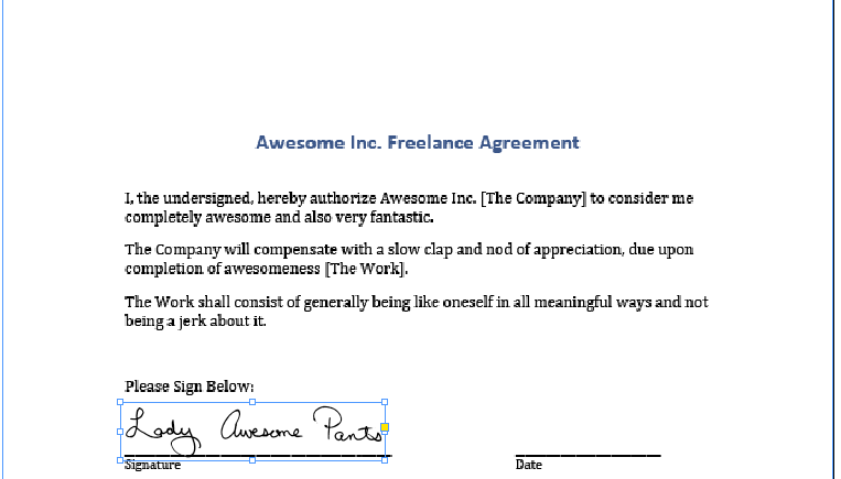
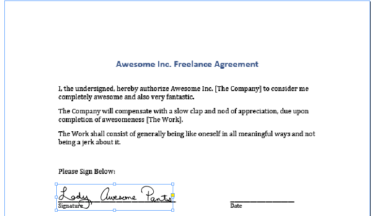
select signature
Select signature


And drag it into place or nudge it with the arrow keys on your keyboard. Even though the black signature is on a white background, if you created a bitmap TIFF file, InDesign will treat any white pixels as transparent, so your descenders can dip below the signature line.

signature in place
The signature in its place


That's pretty much it for adding an image. If that's all you need to do, you can skip ahead to the end, where we make a PDF to send.

If you have text to add to the page, you'll need to select your standard text tool from the toolbar. Use this to draw a box over first space requiring text.

create a box for the date
Use the text tool to create a text frame


Type in the relevant text. If, after typing in the text, the frame is blank or the text cut off and you see a little red plus sign, that means your frame is too small to hold the text. Use your black arrow to resize the frame.

With your text frame still selected, go to OBJECT | TEXT FRAME OPTIONS to modify your text frame.

Text frame options
Modify the options for your text frame


The default vertical alignment is TOP. From the drop-down, choose BOTTOM. This step is totally optional but it makes it easier to align items to a visual baseline.

Change the vertical alignment
Set vertical alignment


If you were about to fill out a bajillionty page contract or job application, and you wanted to save yourself a few moments, you could use this opportunity to define the current text frame settings as your default text frame settings. That's a bit out of the scope of this tutorial, but the options for defining object styles are in the Object Styles Palette, which look a little like this.

The vertical alignment change will push your text to the bottom of the text frame. It will look something like this.

vertical align bottom
The date is aligned to the bottom of the text box


You can nudge the text frame so that it is as far above of the line as you find visually acceptable.

nudge text frame
Nudge text frame into place


To quickly create a second text frame with the same attributes, hold down Option (Mac) or Alt (PC) button and click and drag on the text frame. This will create a copy of the text frame, leaving the original one where it was. Drag or nudge it into its final position.

Option/Alt drag the text frame to make a copy.
Create a second text box


Double click on the frame to edit the text or switch to your text tool, and then modify the text.

change the text
Update the new text box


Continue in this manner until you've filled out all the applicable information and signed in all the indicated spots.

The only step remaining is to create a PDF. Go to FILE | EXPORT. A dialog box will appear. Choose Adobe PDF (Print) from the Format drop-down list.

Choose PDF
Choose PDF from the drop-down


Name your PDF and click Save to complete the process.

give your pdf a name
Save your PDF


That's it! Your contract is ready to email back and you have a signed digital copy for your records.

I may actually add a part 4 to this 3 part series. Microsoft Word does allow the placement of PDFs and you could do a hybrid of the two methods to sign a PDF in MS Word. This would work well for people who do not wish to invest in buying and/or learning a desktop publishing application.

May 25, 2012

Signing Digital Contracts: Adding your signature to a MS Word File

This is part two of a three part series on adding your signature to digital files. In the first part, we discussed making a TIFF of your signature. In this part, we'll discuss adding your signature to a contract, if it's sent to you as an editable Microsoft Word file.

If you want to play along with the home game, you can download the signature, a sample Microsoft Word contract and a sample PDF contract by clicking the links.

For this step, you'll need:

*I'm using Microsoft Office 2008 on a Mac. This should work in programs like Open Office, Pages, or other word processing programs, but the individual steps my vary. You can refer to your help menu or user manual for more guidance.

Before we get started, let me just say that word processors are called, "word processors" because they are meant to, um, process words. I know, obvious. But the point is that word processors are not layout design tools. They support including images and spreadsheets and flow charts and various and sundry other bells and whistles, but just as you'd want to track your businesses expenses in Excel, not Word, you need to accept that Word manages layout design duty the way Carrot Top manages his face (it ain't pretty.) All this is to say that while Word does an acceptable job of allow you to plop your signature into a document, it's not an ideal solution. Personally, if it's an option, I'd rather save the document as a PDF and use the method I'll be outlining in the third and final portion of this tutorial. But it's good to know these skills, regardless, so I'm covering them here.

Begin by opening your contract in Microsoft Word.

Place your cursor where you'd like to place your signature and go to INSERT | PICTURE | FROM FILE

import image
Insert picture

Navigate to your signature and double click it.

Note: If the image is grayed out, it means the signature is a file format your word processor doesn't support. Word is pretty accommodating, open source alternatives may be more restrictive. If your image file format is not supported in your word processing program, open your signature in your photo editing software and save it as another file format. JPEG should work fine for this purpose.

Your image will now appear somewhere near where your cursor was. It has probably caused portions of the page to reflow, move or shift in some aesthetically unpleasing way. Depending on how the page is formatted, it may look acceptable or it may look more like the example below.

signature on the paeg
Image imported

Double click the signature to pull up the Format Picture dialog box. Your dialog box may look different than the image below. Look along the left side and choose the LAYOUT option from the list.

format picture - layout
Format Picture Layout options

From the Wrap Style icons, choose IN FRONT OF TEXT. When you make edits, in the dialog box, you'll see changes happening on the page. Do not be alarmed if your picture jumps around even if it's not in you view at that moment. Click OK to continue.

Find your signature on the page. Mine jumped down to the bottom. Remember what I said about Word being a not-good tool for layout? This is a good example. Why changing the wrap should send the image hurtling to the bottom of the page is beyond me, but there it is.

free range signature
Signature on the loose

Move your cursor over the signature, click it and drag it into position. In Word, I place it just above the signature line so that it doesn't overlap. You can drag the corner of the signature, holding down your SHIFT key so it doesn't distort, to adjust its size on the page.

moved and resized
Signature in the right place, at the right size

Depending on how your contract is formatted, the underlines may be created by applying an underline style, adding an underline to a tab stop or by typing an underscore repeatedly. I find the last used most often so that's what's in our sample contract, but in any of those cases, you'll probably need to include the date and your name somewhere. Unless someone has made an interactive form, there's really no pretty way to handle this short of reformatting someone else's file so I usually just settle for the"good enough" solution that follows.

Select enough underscore characters to accommodate the date. If you are using a MM/DD/YY type format, you won't need to select many characters. If you are using the FULLMONTH DAY, YEAR format, you may need to select the whole line.

select the line where the date goes
Selected underscores

Type in the date. If you removed too many underscores, you can simply type additional ones in. If you didn't select enough underscores and some have jumped to the next line, just delete them.

Repeat this process for your name.

do the same for your name
Add your name

And that's it!

You can email your contract back as is, or save it as a PDF if you prefer. Personally, I'd rather send a PDF which can be locked so that the signature file cannot be reused. It's not a foolproof plan but handing a high quality picture of your signature off to someone you barely know, just seems a little unwise.

May 24, 2012

Signing Digital Contracts: Creating a Signature

As a freelance designer, I sign a lot of contracts. It's just part of working with businesses on a project by project basis, and about 99% of the time, those contracts come to me as digital files.

I have a fax machine at home, and I could print out my contract, sign it, fax it to the person who needs it, who probably gets their faxes printed out on more paper and then I could wait to get a copy of the version they signed, and file that away, but honestly, that seems wasteful and unnecessarily labor intensive. I'm also partial to storing files digitally so the paper workflow is not ideal. I have enough unsorted clutter in my house.

As a side note, while I'm posting this as a knitwear design tutorial, it really is just a useful thing to know in general. This skill was invaluable when we were buying a house, and again when we refinanced. If you are applying for jobs, filling out contracts, or signing any file you receive digitally, you can use the methods I'll be covering.

In this post, we'll be covering the creation of a reusable image of your signature. Because I'm not completely out of my gourd, I am going to be using a signature of my nom de rien, Lady Awesome Pants, as opposed to my actual real signature, which someone might want to use for nefarious reasons.

In the following posts, we'll discussing using the image to sign your contract.

If you want to play along with the home game, you can download the signature, a sample Microsoft Word contract and a sample PDF contract by clicking the links. You can also download the unretouched scan of the signatures, here.

For this step, you'll need:

  • pen
  • paper
  • scanner or digital camera
  • Adobe Photoshop or photo editing software of choice*

*I'm using Adobe Photoshop CS5 on a Mac. If you are using a different photo editing software, you may need to refer to your user's manual.

Find yourself a good, medium point, dark (preferably black) ink pen and a clean piece of paper (no lines, no show-through from anything printed on the other side) and write your name and/or initials a bunch of times. Try to do this on a surface that's not too hard, a catalogue under your piece of paper works nicely. Press firmly as you sign. You don't want a light whispy signature, you want something clear and legible.

signature samples
Signature Samples

Once you know you have at least a few examples that you like, get ready to scan your page. I usually scan the whole page. Sometimes, it's not until after you've cleaned up the scan, that you can tell which signature will work best. I like to scan at a high resolution, in grayscale, to ensure I get all the detail I need with no unnecessary noise.


Scanning settings

If you don't have a scanner, you can photograph your signatures with a digital camera, just make sure you do so in good, natural light, on a background that won't show through your paper and that the signatures are in focus.

Depending on your scanner, your digital camera, the lighting, and whether or not you fed your Mogwai after midnight, your digital file may be too dark or too light or otherwise somewhere short of perfection.

Note: If you scanned or photographed your signature in color, convert your file to Grayscale by going to IMAGE | MODE | GRAYSCALE before proceeding.

Scan
This raw scan is not living up to its full potential

In Photoshop, go to IMAGE | ADJUST | LEVELS

This will bring up a set of sliders that will allow you to clean up your scan. Bring the black triangle as close to the white triangle as possible. That will make everything on the page either pure white or pure black and remove all shades of gray. Play around with moving them more to the left and more to the right. One direction will make your lines appear thicker, the other will make them thinner.

adjust levels
Adjust Levels

Next we'll convert the mode to Bitmap. Your image must already be grayscale for this option to be available. If it's not grayscale, convert it now. Bitmap files are made up of only black and white pixels, no shades of gray, no color. This is a good format for pixel based logos and line art. Additionally, many programs, like InDesign, Quark and other desktop publishing applications, will view the white pixels in bitmap images as transparent, which can be useful with signatures that are supposed to sit on a line. You'll see how this works in the InDesign portion of this tutorial, to come at a later date.

Go to IMAGE | MODE | BITMAP


Convert image to Bitmap
Change Mode to Bitmap

Choose 50% Threshold from the Method drop-down. I like a resolution of about 1200 dpi. I would avoid going below 1000 dpi.

bitmap settings
Settings for conversion to Bitmap

If you adjusted your Levels properly, you won't notice much change in your file. If your signature looks too washed out or too blobby (technical term) after conversation, that means you didn't adjust your Levels slider to be close enough together. Simply undo and adjust your Levels further.

If you are happy with the results, you can crop your image so that you only have your favorite signature visible.

cropped signature
Cropped

Save your file as a TIFF.

Save as tiff

You might be thinking, "But Marnie, what is this TIFF madness of which you speak? Why can't I save it as a JPEG?"

JPEGs do not support the BITMAP format because JPEGs are always, RGB (color) images. So all that work converting to a bitmap, to make a good quality piece of line art, will be lost. It will still work well enough, but if your image software supports Bitmap and TIFF format, that's the way to go.

That's all there is to it. You now have a lovely file of your own signature, that you can use to sign digital files.

In the next tutorial, we'll talk about using the file to sign Microsoft Word documents and in the third and final installment, we'll use this file in InDesign and talk about adding typed text to PDF forms.

About design

This page contains an archive of all entries posted to Marnie, speak! Good girl. in the design category. They are listed from oldest to newest.

excel is the next category.

Many more can be found on the main index page or by looking through the archives.

Site Info

Powered by
Movable Type Pro 5.14-en